This version of the logo should be used as more of a reminder of our brand – where our logo or brand name has already been utilized or mentioned multiple times within the document.
There should always be ample space around the logo.
The Primary Basecamp brand font is Gotham.
Variations on this font (eg. Gotham Light, Italics, etc) may be used, if used appropriately and within the below hierarchy.
Header Font (Gotham Pro)
Body Copy font (Gotham Book) Posuere aliquam. Integer vestibulum mi leo, ac accumsan metus bibendum vitae. Proin quis neque volutpat, ultricies augue et, fringilla lectus. Nulla facilisi
03.
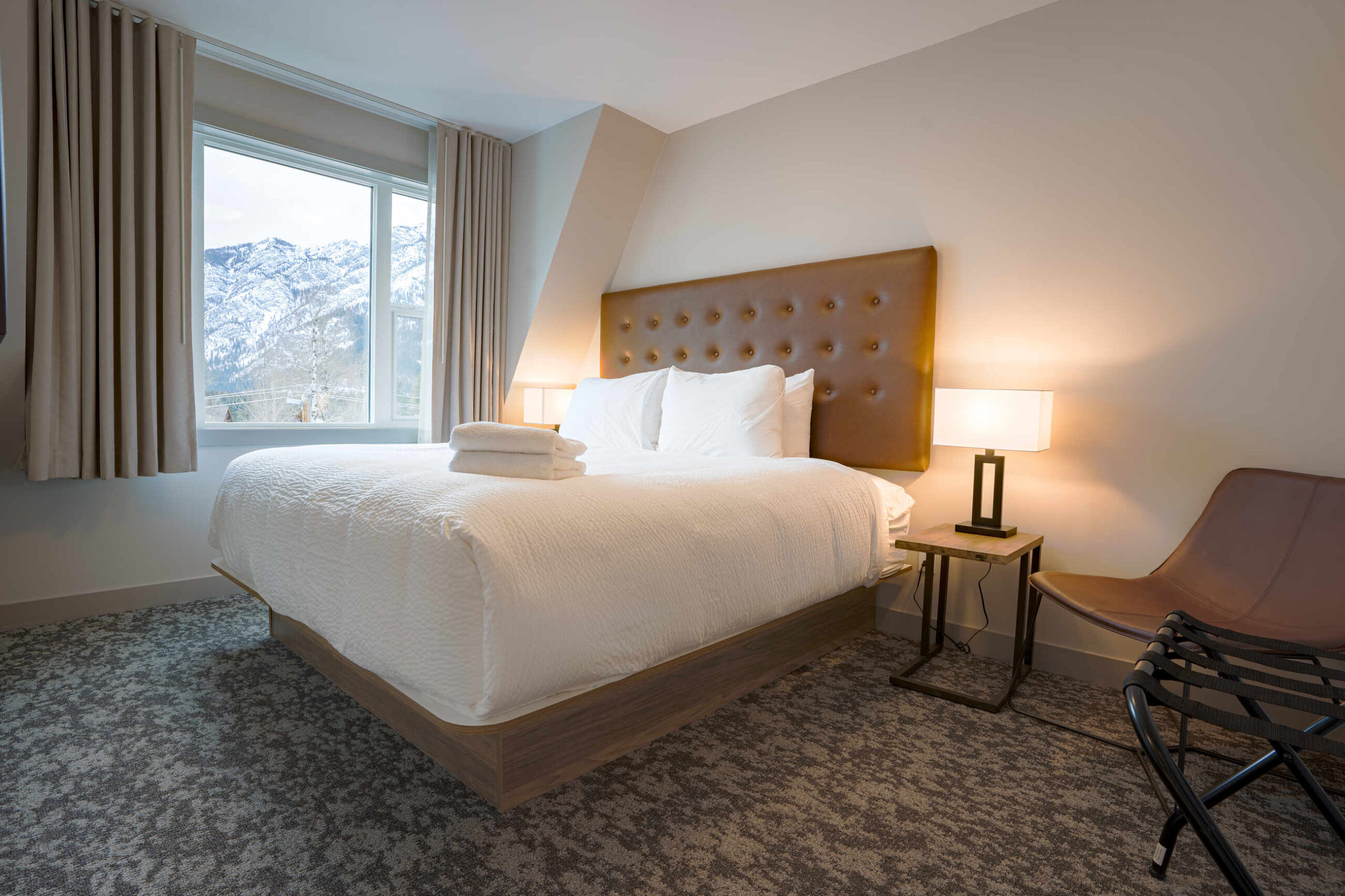
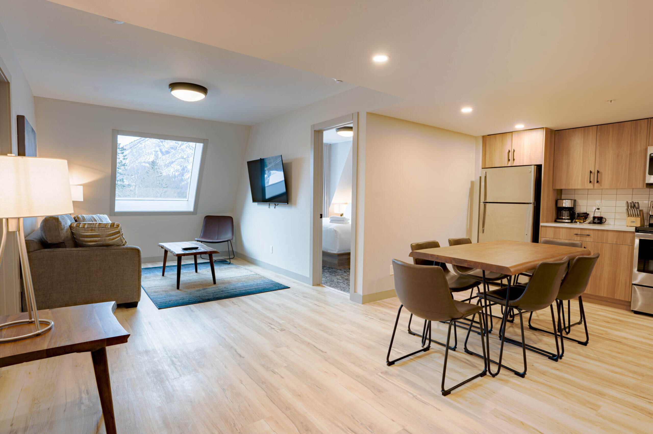
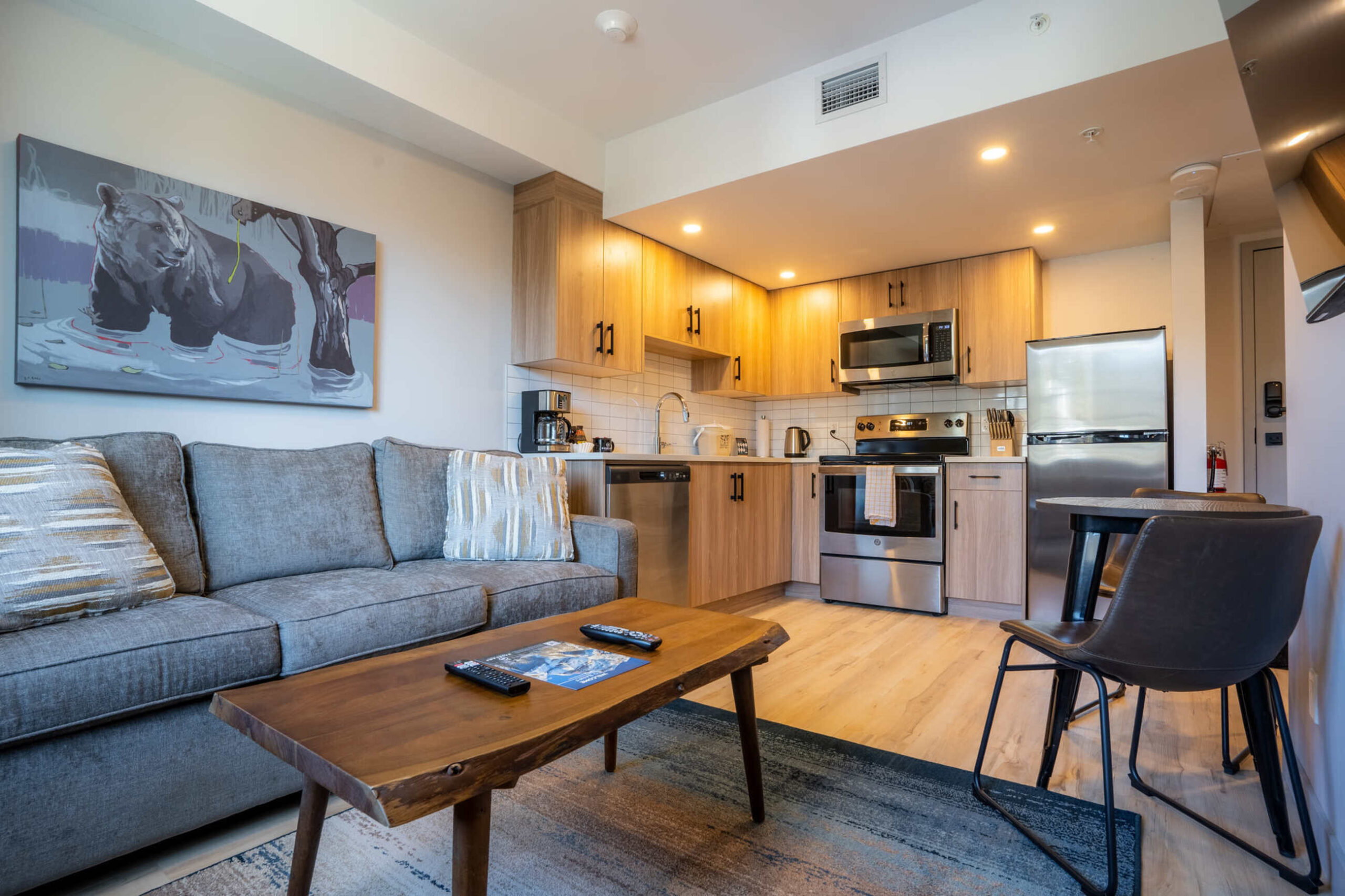
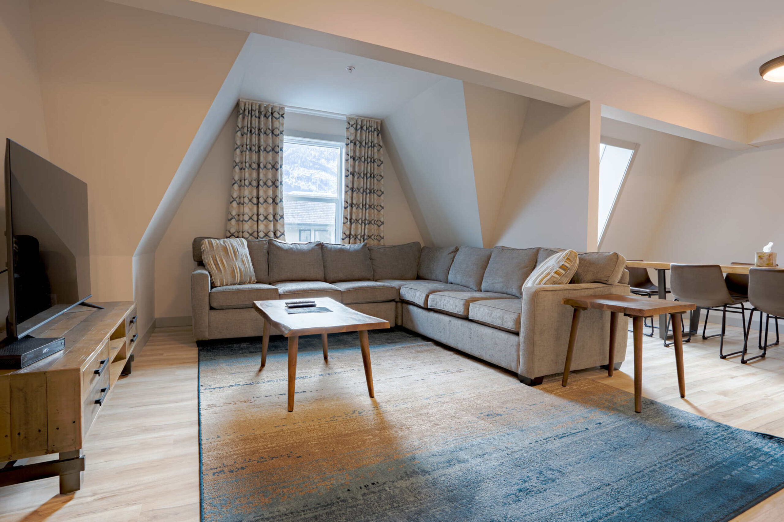
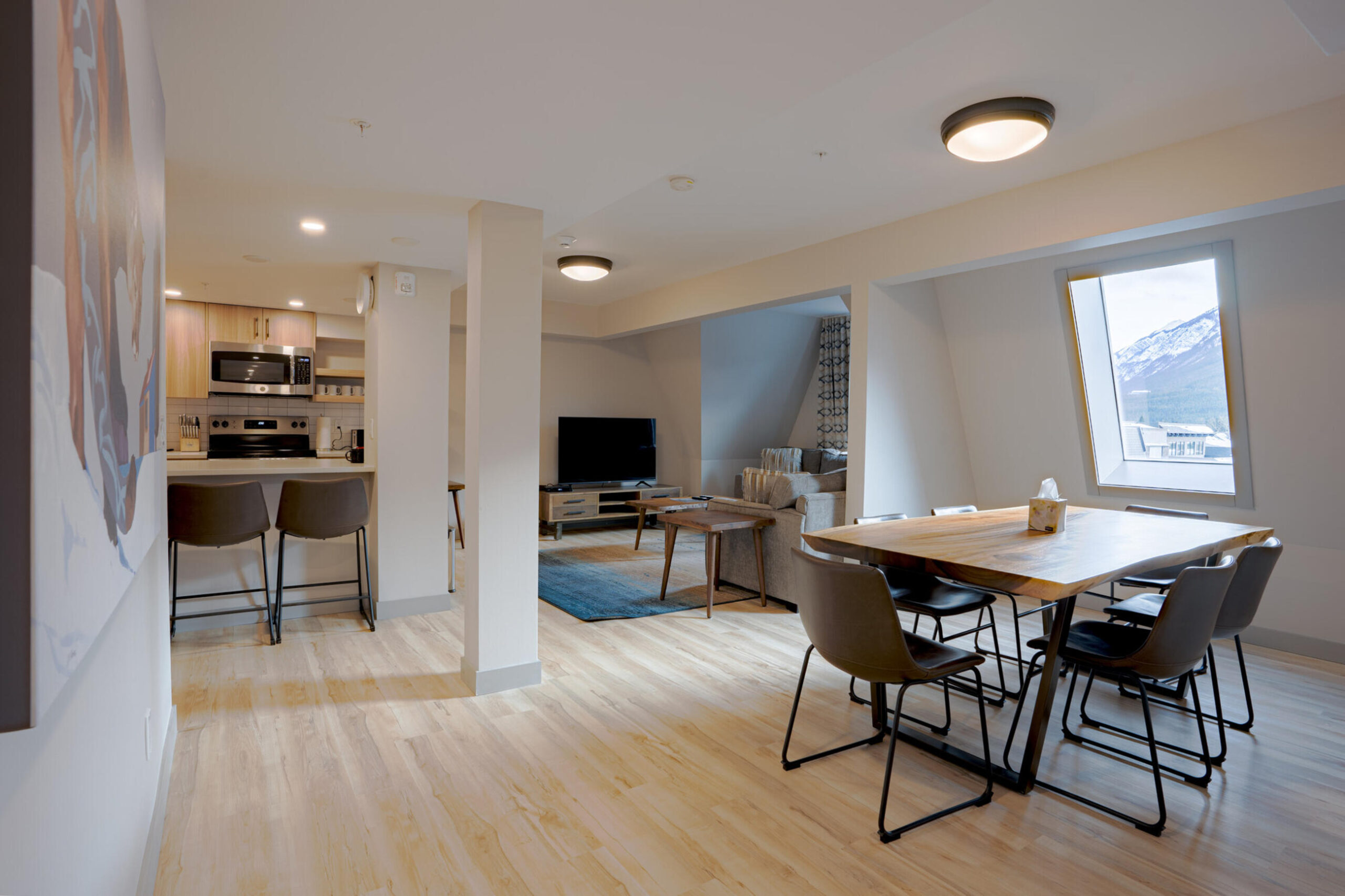
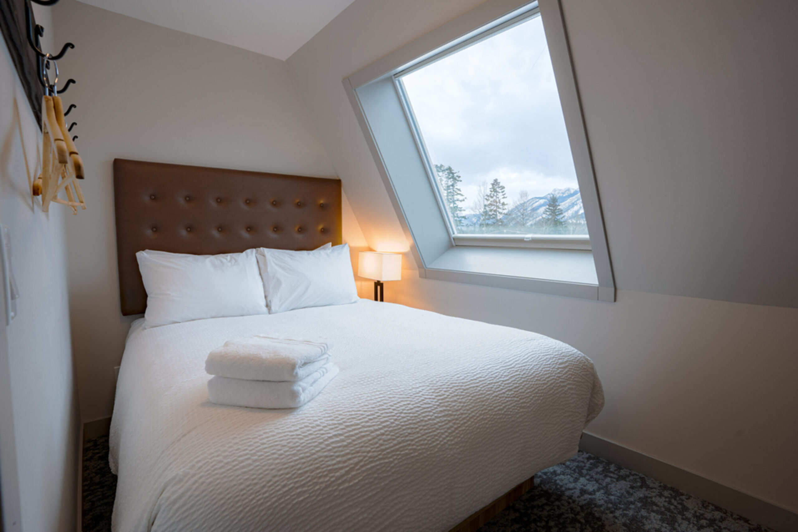
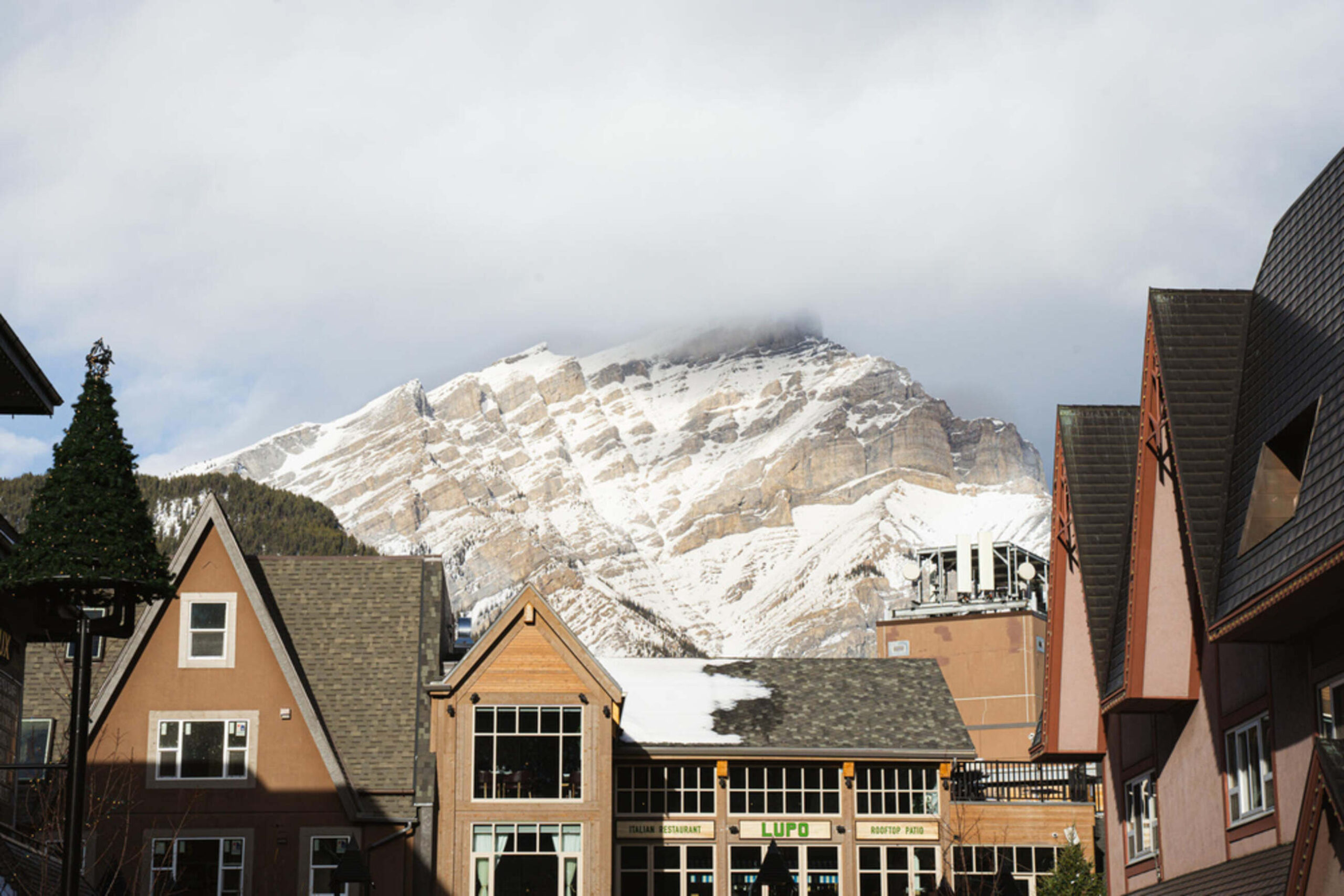
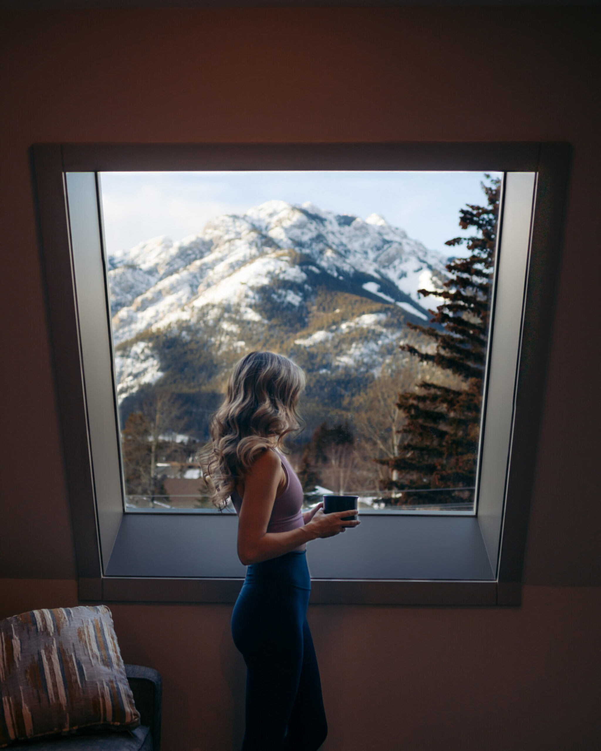
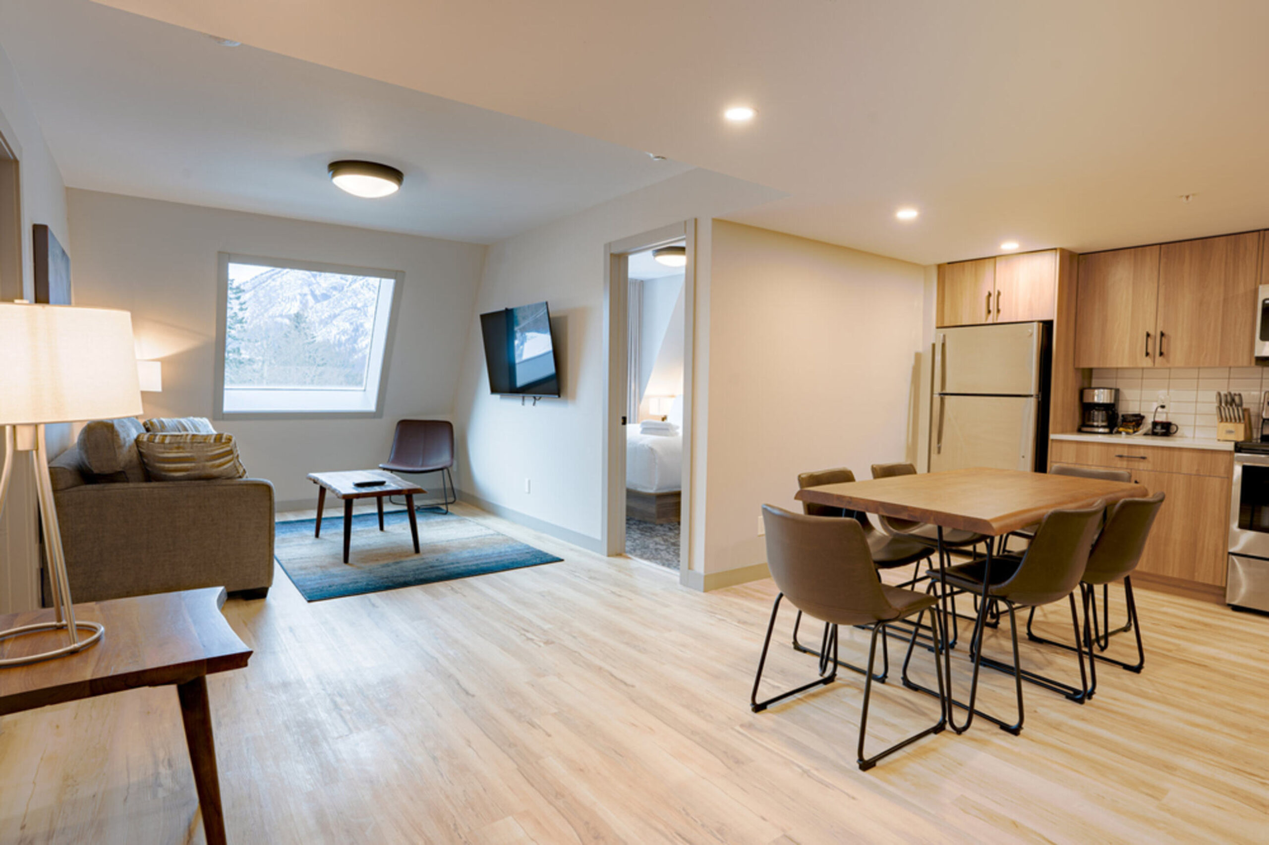
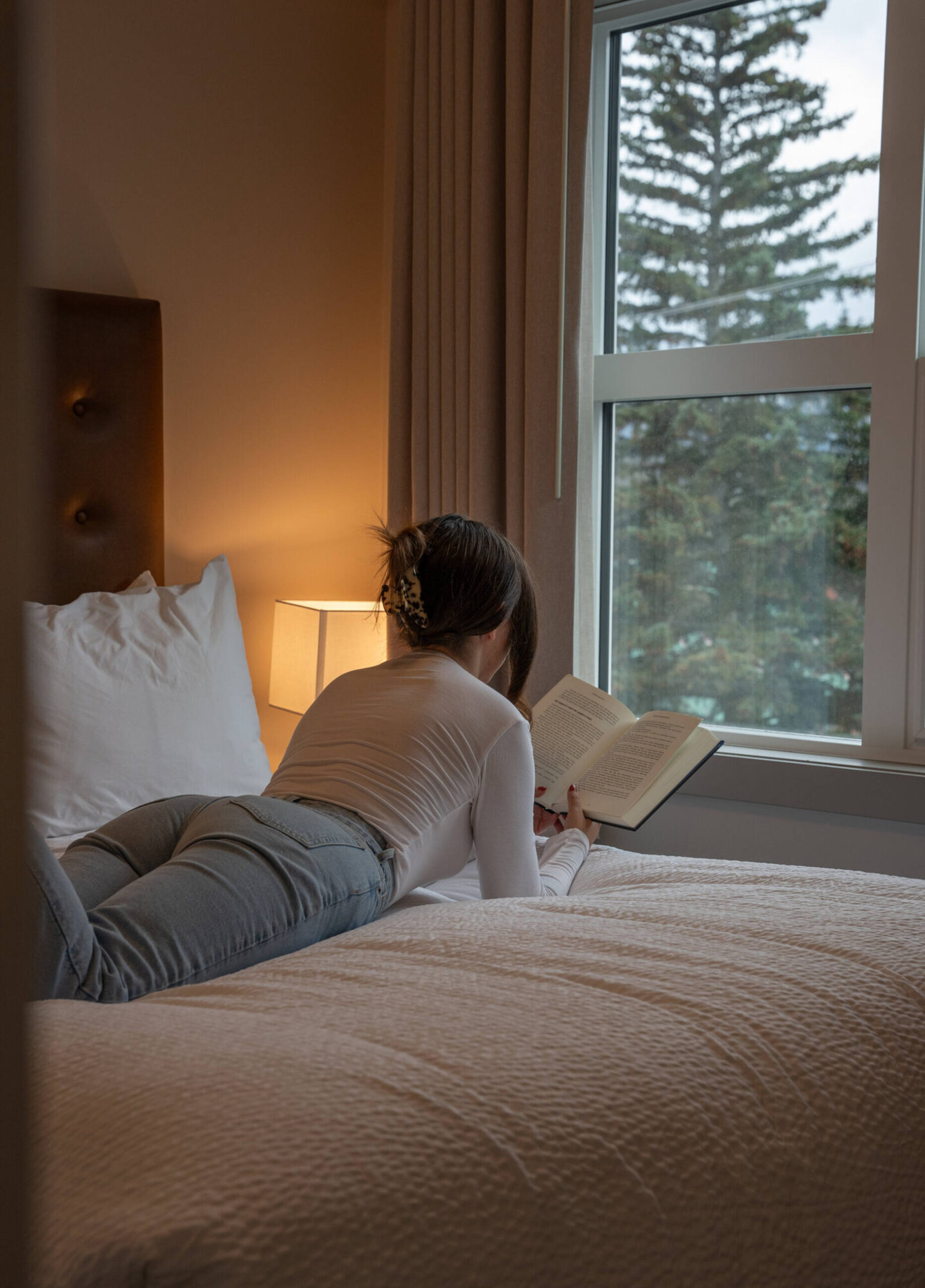
Photos
A gallery of our favourite property images. Do not stretch, distort or alter these images in any way
Use direct, energetic language: speak to “you,” keep it engaging, and ask questions when it fits.
Use language like: explore, discover, escape, unwind, book now Avoid: formal, stiff, or passive phrasing
06.
Story Angles
1. Right in the Middle of It All This is Banff at full volume. Step outside and you’re instantly in it, crowded patios, mountain views down Banff Avenue, last-minute dinner plans that turn into late nights. No shuttles, no planning, no missed moments. It’s the kind of stay where everything is happening around you, and you’re part of it from the second you arrive.
2. Banff, Start to Finish Early coffee runs, full days in the mountains, spontaneous shopping stops, dinners that turn into drinks, then back up to the rooftop hot tubs as the town winds down below. This is a stay that keeps pace with Banff from morning to night, without ever breaking the flow. No commuting, no resets, just one continuous experience from start to finish.
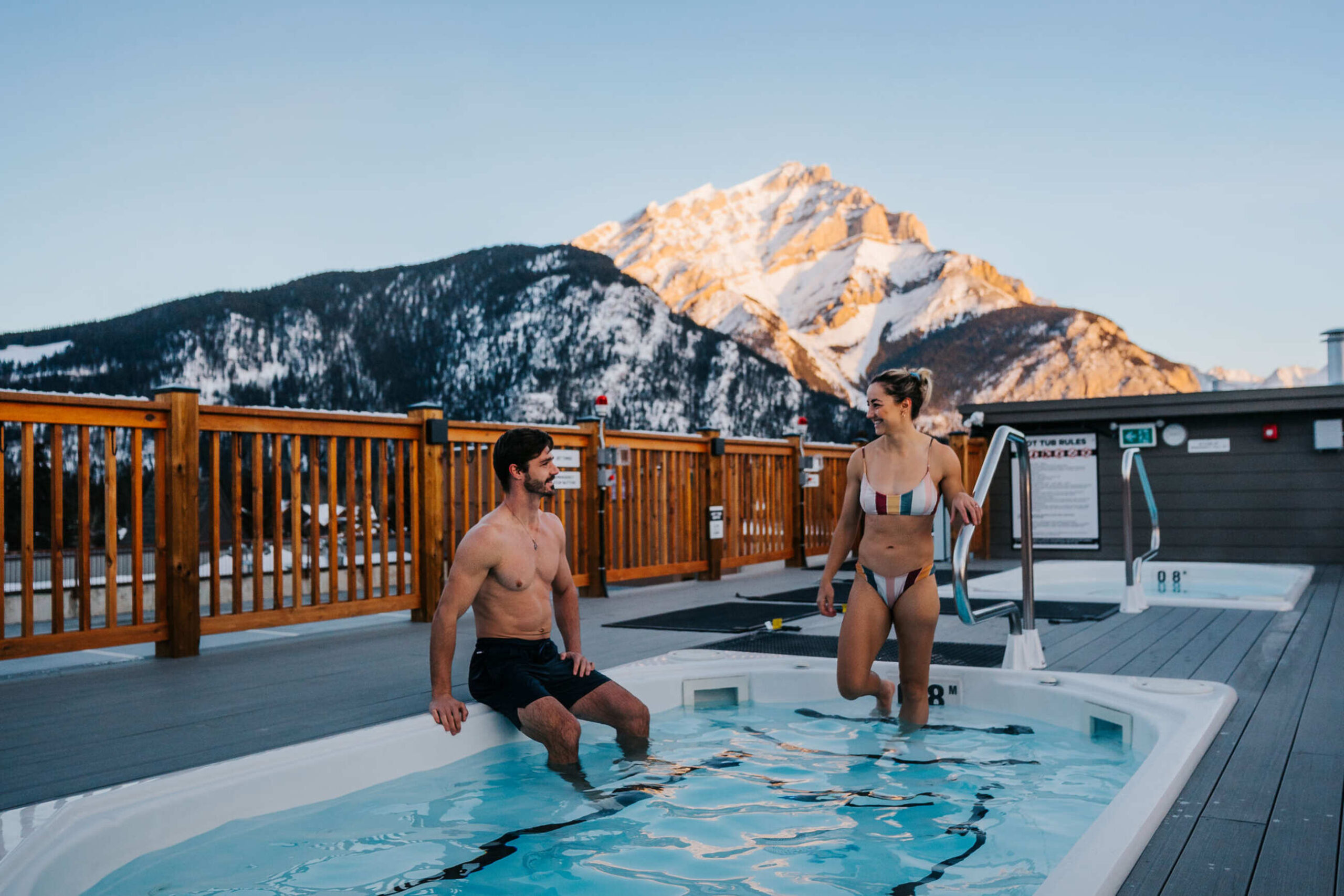
3. Rooftop Soaks After the Slopes After a day of hiking, skiing, or strolling Banff Avenue, guests can unwind in one of two rooftop hot tubs overlooking the surrounding peaks. Connected parkade access and a staffed front desk add convenience to a stay designed for comfort in the heart of the Rockies.

