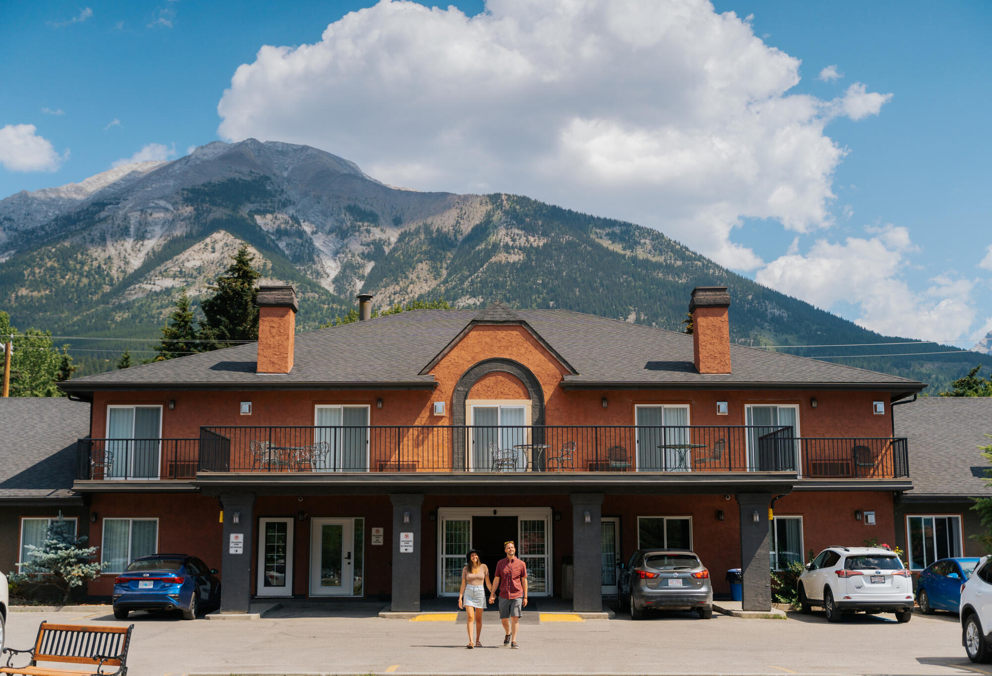
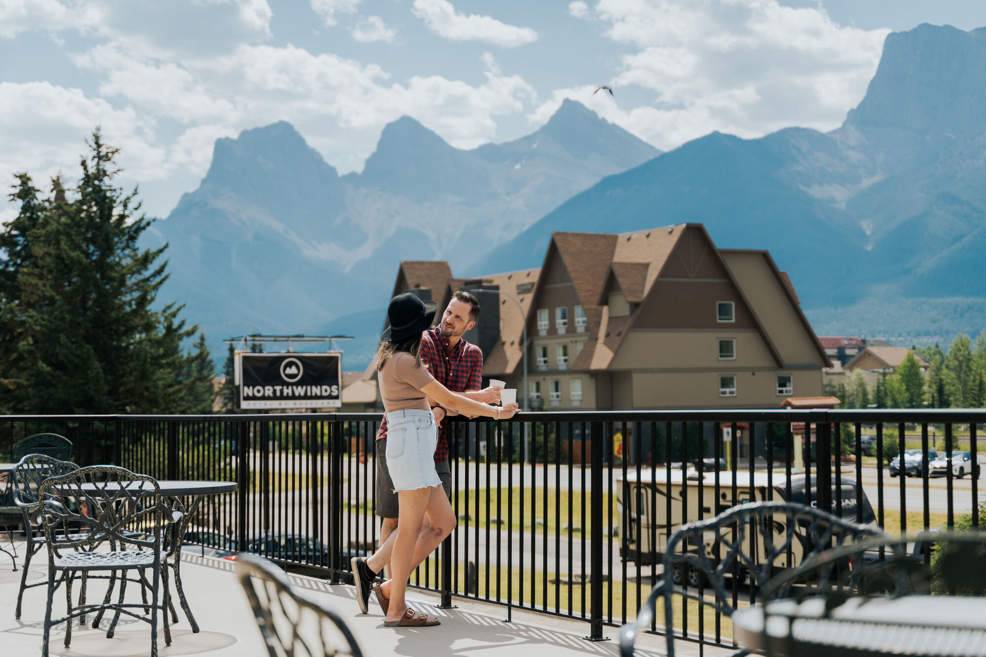
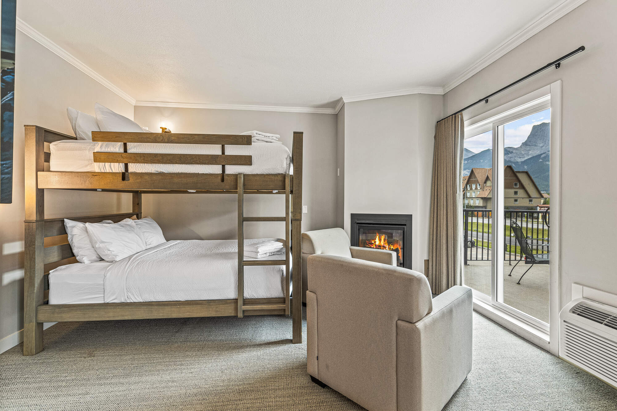
Description: Guest rooms at Northwinds Revelstoke offer modern comforts and practical amenities, including locally sourced bath products and comfortable linens. Located minutes from downtown, the hotel provides convenient access to Revelstoke’s outdoor recreation and town amenities.
This version of the logo should be used as more of a reminder of our brand – where our logo or brand name has already been utilized or mentioned multiple times within the document.
There should always be ample space around the logo.
The Primary Basecamp brand font is Gotham.
Variations on this font (eg. Gotham Light, Italics, etc) may be used, if used appropriately and within the below hierarchy.
Header Font (Gotham Pro)
Body Copy font (Gotham Book) Posuere aliquam. Integer vestibulum mi leo, ac accumsan metus bibendum vitae. Proin quis neque volutpat, ultricies augue et, fringilla lectus. Nulla facilisi
03.
Photos
A gallery of our favourite property images. Do not stretch, distort or alter these images in any way
Use direct, energetic language: speak to “you,” keep it engaging, and ask questions when it fits.
Use language like: explore, discover, escape, unwind, book now Avoid: formal, stiff, or passive phrasing
06.
Story Angles
1. Chasing Snow, Not Sleep
This is for the kind of ski trip where sleep comes second. Early starts, deep turns, and full days chasing some of the best powder in North America. You’re not here to hang out in your room, you’re here to be out there. Northwinds keeps things simple and close so nothing gets in the way of getting back on the mountain.
2. In, Out, Repeat
This is a place for travellers who are barely inside. You’re out early, back late, and already planning the next move. Whether it’s the mountain, the trails, or the town, everything is within quick reach, so the day never slows down. It’s a stay that keeps up, without overcomplicating anything.
3. The Stop That Turns Into a Stay
You pull into Revelstoke thinking it’s just a stop, then everything changes. One night turns into two, plans shift, and suddenly you’re building your trip around staying longer. Northwinds makes that easy, giving travellers a flexible, no-fuss place to land while the mountains convince them to stick around.