Description: Located along the Kananaskis River, accommodations include year-round glamping and camping options in a mountain setting. Enjoy heated glamping tents in winter and seasonal outdoor accommodations designed for families, groups, and couples seeking a quieter, nature-focused experience.
This version of the logo should be used as more of a reminder of our brand – where our logo or brand name has already been utilized or mentioned multiple times within the document.
There should always be ample space around the logo.
The Primary Basecamp brand font is Gotham.
Variations on this font (eg. Gotham Light, Italics, etc) may be used, if used appropriately and within the below hierarchy.
Header Font (Gotham Pro)
Body Copy font (Gotham Book) Posuere aliquam. Integer vestibulum mi leo, ac accumsan metus bibendum vitae. Proin quis neque volutpat, ultricies augue et, fringilla lectus. Nulla facilisi
03.
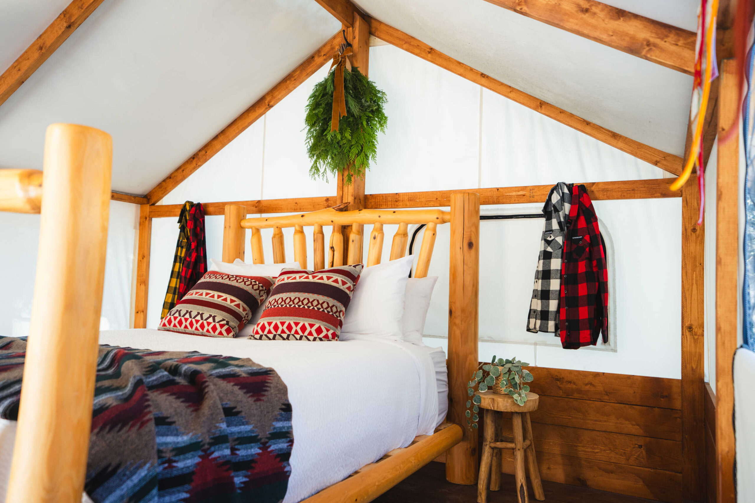
Photos
A gallery of our favourite property images. Do not stretch, distort or alter these images in any way
Use direct, energetic language: speak to “you,” keep it engaging, and ask questions when it fits.
Use language like: explore, discover, escape, unwind, book now Avoid: formal, stiff, or passive phrasing
06.
Story Angles
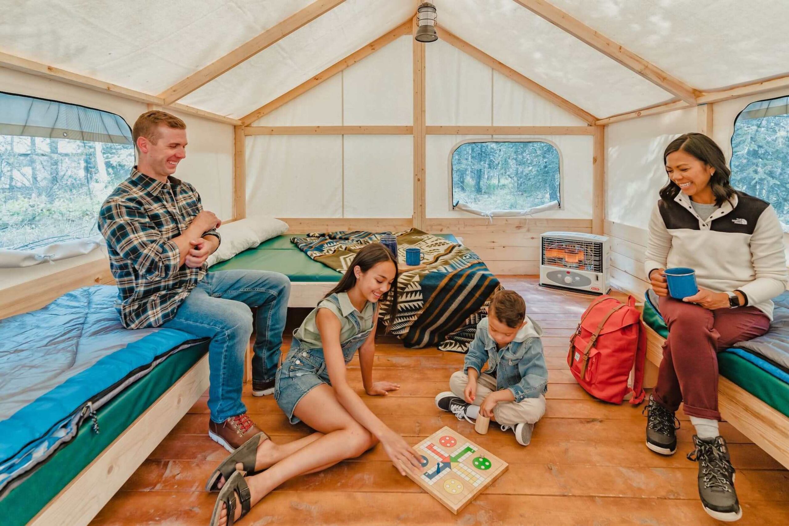
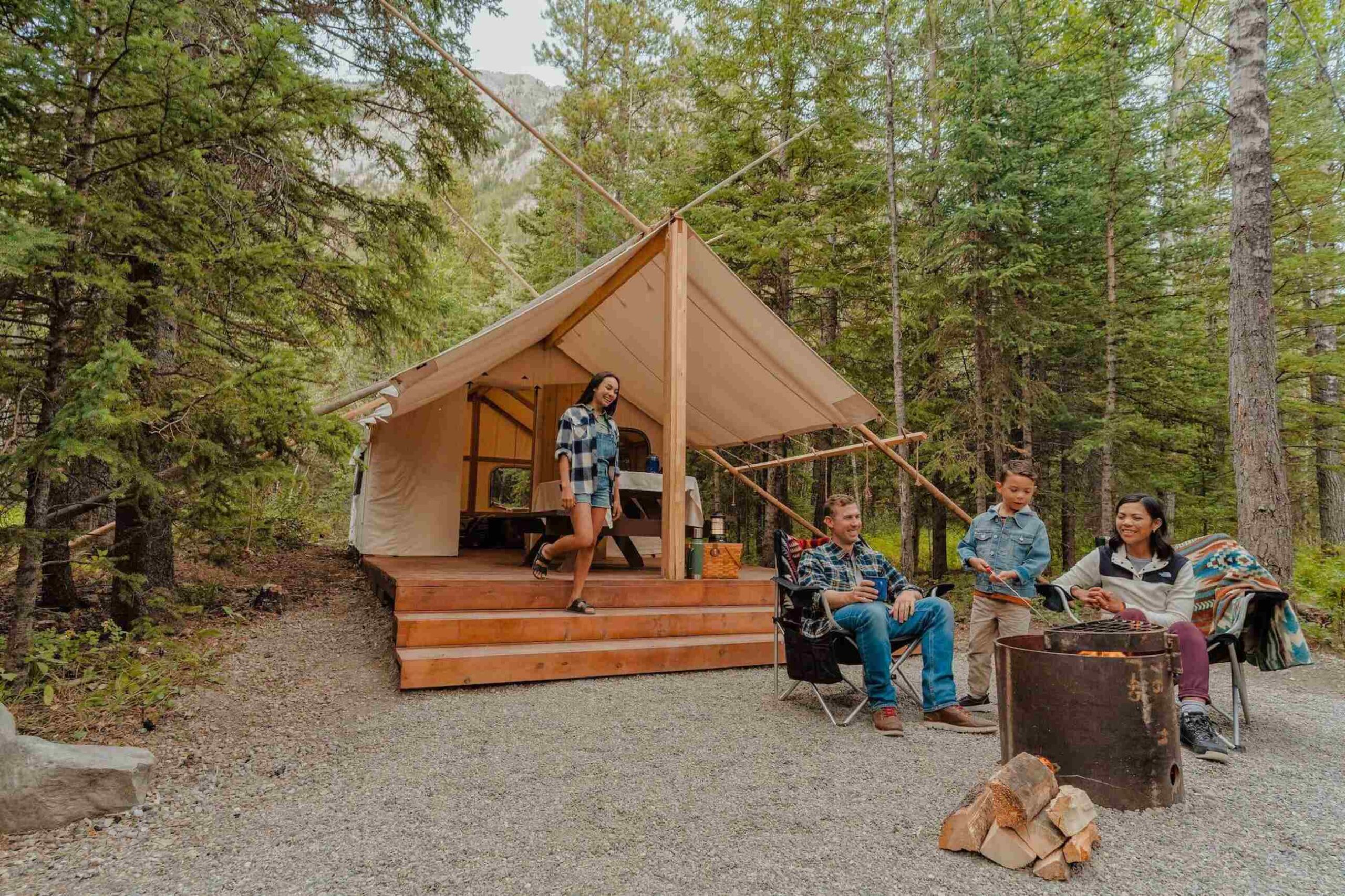
1. Four-Season Camping, Elevated Camping doesn’t end when the temperature drops, it just gets better. Sundance reimagines the outdoor experience with heated glamping tents and year-round stays that bring comfort into every season. Wake up to crisp mountain air, spend the day exploring, and return to a warm, fully set-up space, no gear hauling, no roughing it. With hot showers, running water, and thoughtful onsite amenities, it’s the kind of camping that keeps the adventure but upgrades everything else.
2. Endless Adventure in Kananaskis Country Sundance Kananaskis places guests in the heart of Kananaskis Country, surrounded by hiking trails, rivers, wildlife viewing, and some of Alberta’s most scenic mountain landscapes. From day hikes and paddling to wildlife spotting and exploring nearby provincial parks, the area offers endless ways to experience the outdoors. With a woodsy setting and comfortable accommodations, Sundance makes it easy for guests to explore K Country without needing a traditional camping setup.
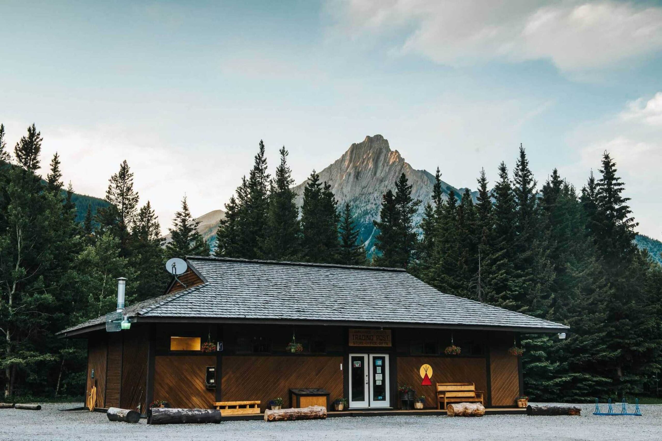
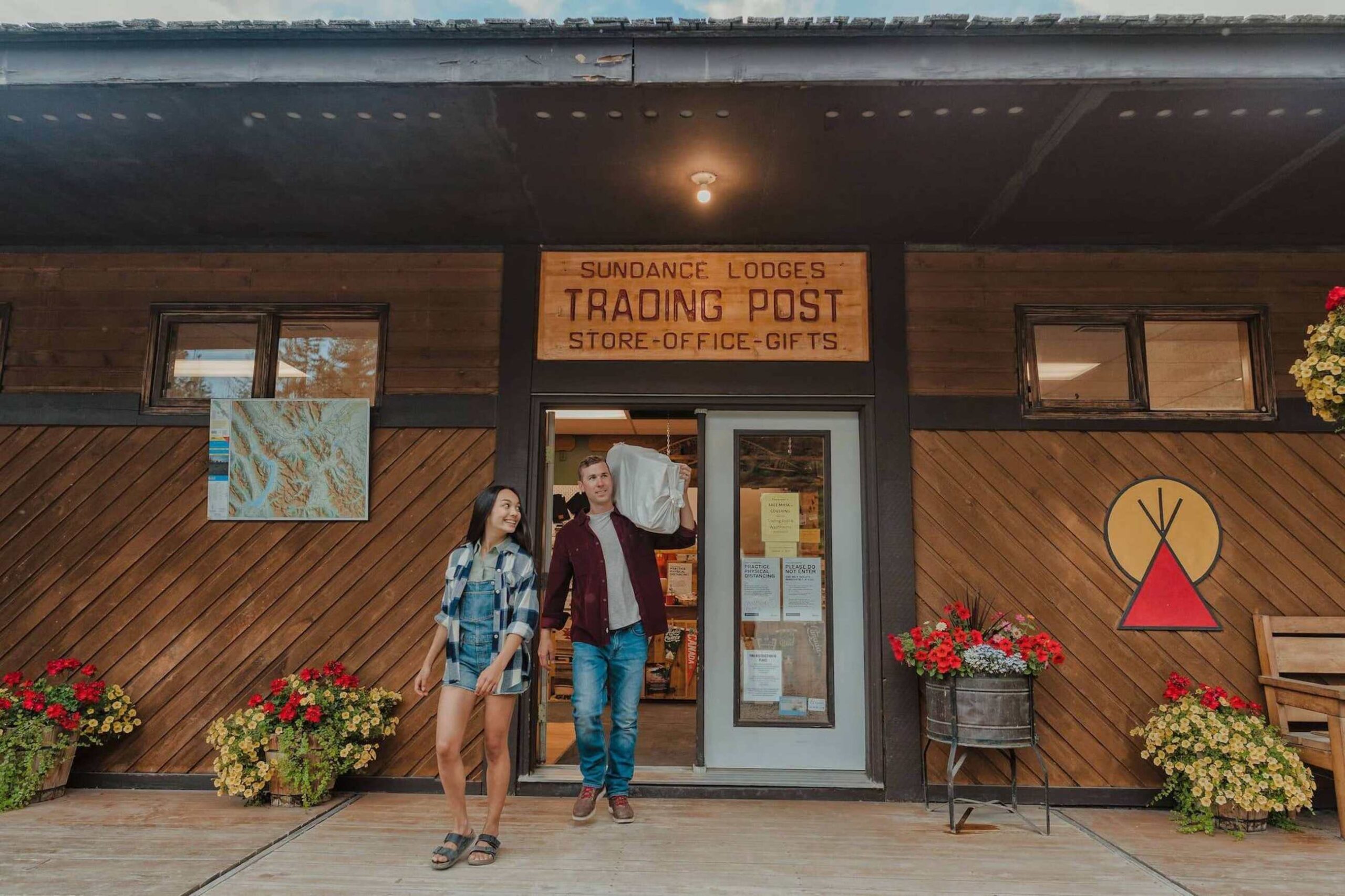
3.Accessible Adventure Near Calgary Just a short drive from Calgary, Sundance Kananaskis offers an approachable gateway to mountain adventure. With 84 accommodation options ranging from family tipis to trapper tents and campsites, it delivers a nature-immersive stay supported by practical comforts and year-round accessibility.

