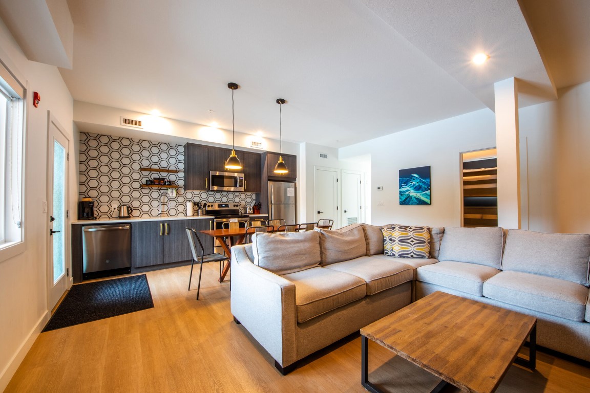
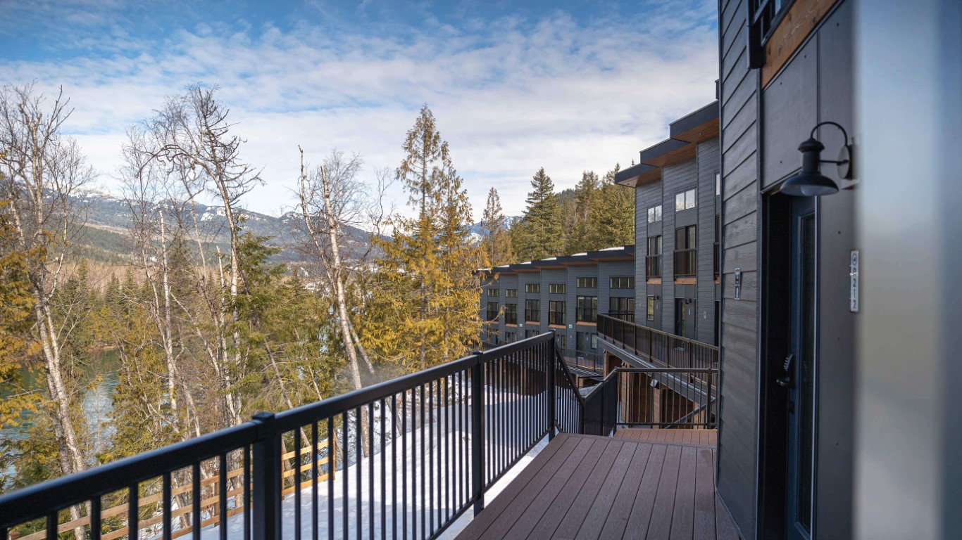
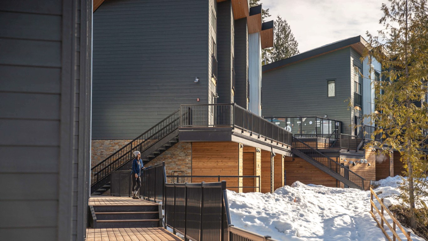
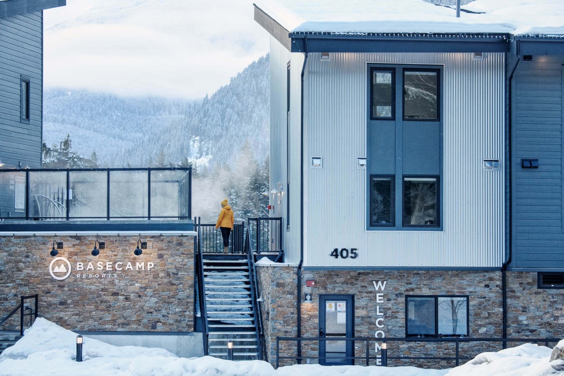
Description: The hotel features modern suites with flexible layouts and views of the Columbia River. Designed for comfort and convenience, it provides easy access to outdoor recreation and year-round activities.
This version of the logo should be used as more of a reminder of our brand – where our logo or brand name has already been utilized or mentioned multiple times within the document.
There should always be ample space around the logo.
The Primary Basecamp brand font is Gotham.
Variations on this font (eg. Gotham Light, Italics, etc) may be used, if used appropriately and within the below hierarchy.
Header Font (Gotham Pro)
Body Copy font (Gotham Book) Posuere aliquam. Integer vestibulum mi leo, ac accumsan metus bibendum vitae. Proin quis neque volutpat, ultricies augue et, fringilla lectus. Nulla facilisi
03.
Photos
A gallery of our favourite property images. Do not stretch, distort or alter these images in any way
Use direct, energetic language: speak to “you,” keep it engaging, and ask questions when it fits.
Use language like: explore, discover, escape, unwind, book now Avoid: formal, stiff, or passive phrasing
06.
Story Angles
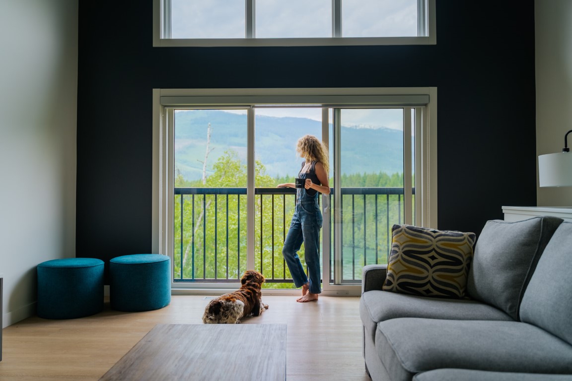
1. Endless Views, No Off Switch
At Basecamp Resorts Revelstoke, the views don’t come and go, they’re always on. Floor-to-ceiling windows, riverside positioning, and patios that open straight to the landscape mean the Columbia River and surrounding peaks are part of every moment. Morning coffee, mid-day reset, late-night wind-down, it all happens with the same uninterrupted backdrop.
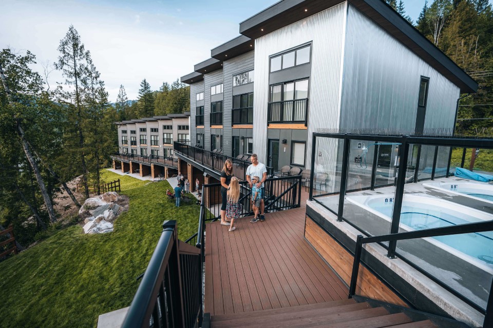
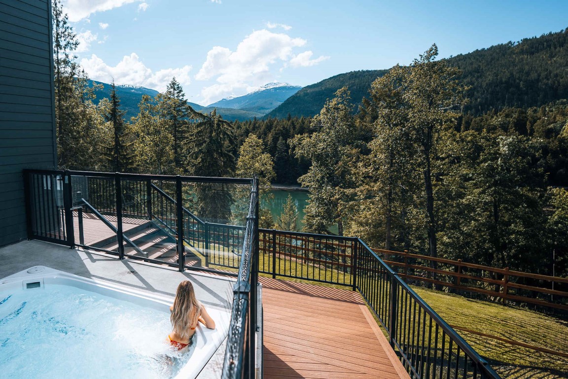
2. Hot Tubs, Right on the River
This isn’t your typical hot tub moment. Set right along the Columbia River, the experience feels fully immersive; steam rising, water rushing past, mountains surrounding you. It’s where the day naturally ends, whether you’re coming back from the slopes or the trail. Simple, social, and one of those moments that defines the entire trip.
3. Built for Powder Days
Revelstoke is known for one thing, deep, world-class powder, and this is the kind of stay that’s built around it. Early mornings chasing fresh lines, full days on the mountain, and evenings spent recovering by the river before doing it all again. When the snow melts, the pace doesn’t slow; hiking, biking, and alpine exploration take over. It’s a year-round destination, but winter is where it truly hits its stride.

