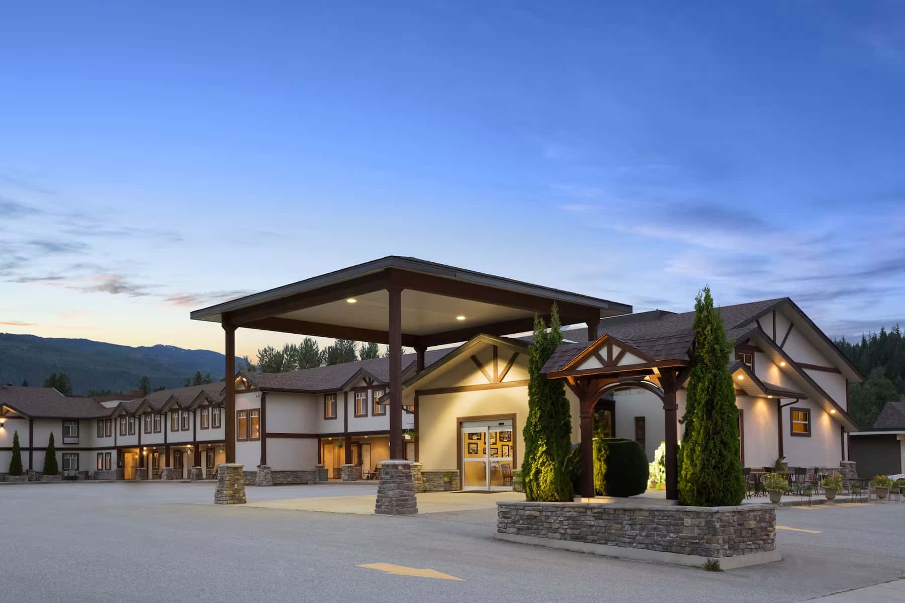
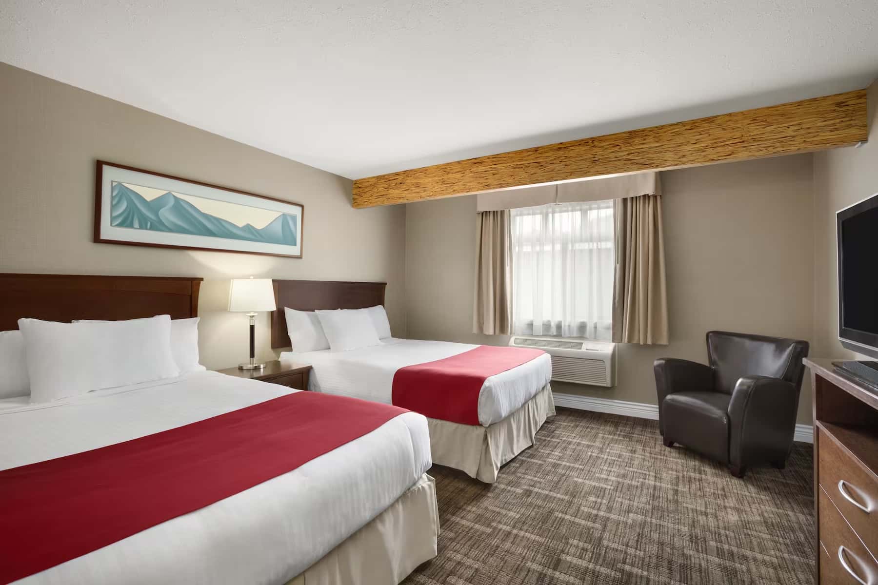
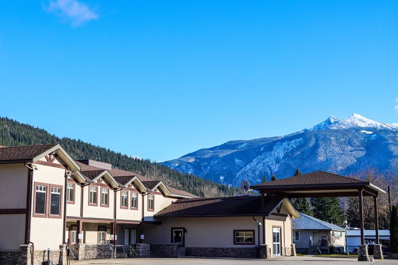
Rhythm & Howl is more than just a dining destination—it’s where great local cuisine meets genuine hospitality in the heart of the Canadian Rockies. With a farm-to-table approach, we highlight ingredients from local suppliers who share our passion for authenticity. At the center of our space is a wood-burning forno, a symbol of warmth and community, connecting us to our Rocky Mountain roots. Whether you’re celebrating, unwinding after a day of adventure, or simply enjoying a handcrafted cocktail, Rhythm & Howl offers an inviting atmosphere that transforms every meal into a memorable occasion.
Tone of Voice
Playful & Quirky
Playful & Quirky
Use engaging and exciting tones of voice, It adds an element of fun and excitement to your communication, making your content shareable and memorable. This style is effective for building a personal connection with your audience. It’s like having a friendly chat with your followers, making them feel like part of an exclusive community.
Inspirational Reflective
Appeals to a sense of wanderlust and the desire for memorable experiences.Encourages followers to plan ahead for upcoming adventures
02.
Color
Each property type has it’s own dedicated (minimal) color palette.
The primary brand color for Rhythm & Howl is:
Coral
RGB: R224 G101 B89
CMYK: C0% M55% Y60% K12%
HEX: #e06559
Sand
RGB: R228 G221 B211
CMYK: C0% M3% Y7% K11%
HEX: #e4ddd3
Stone
RGB: R59 G56 B51
CMYK: C0% M5% Y14% K77%
HEX: #3b3833
Pine
RGB: R042 G045 B001
CMYK: C7% M0% Y98% K82%
HEX: #2a2d01
03.
Logos
& Typography
03.1
Logos
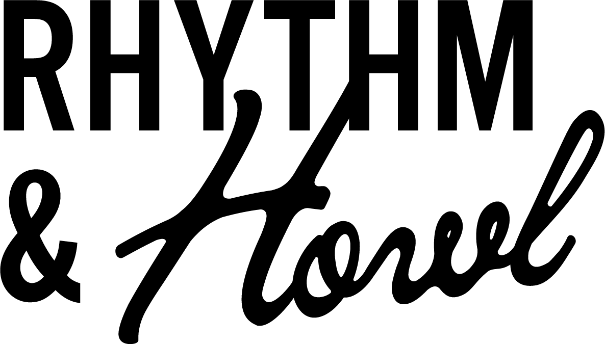
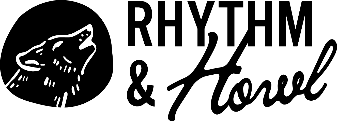
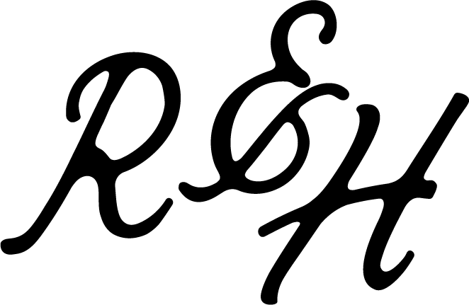
There are multiple versions of the Rhythm & Howl logo, available in all of our brand colors.
The three main logo types are :
The Wordmark:
This logo can be used in situations where a centered layout is used.
There should always be ample space around the logo.
This version of the logo should be used as more of a reminder of our brand – where our logo or brand name has already been utilized or mentioned multiple times within the document.
There should always be ample space around the logo.

