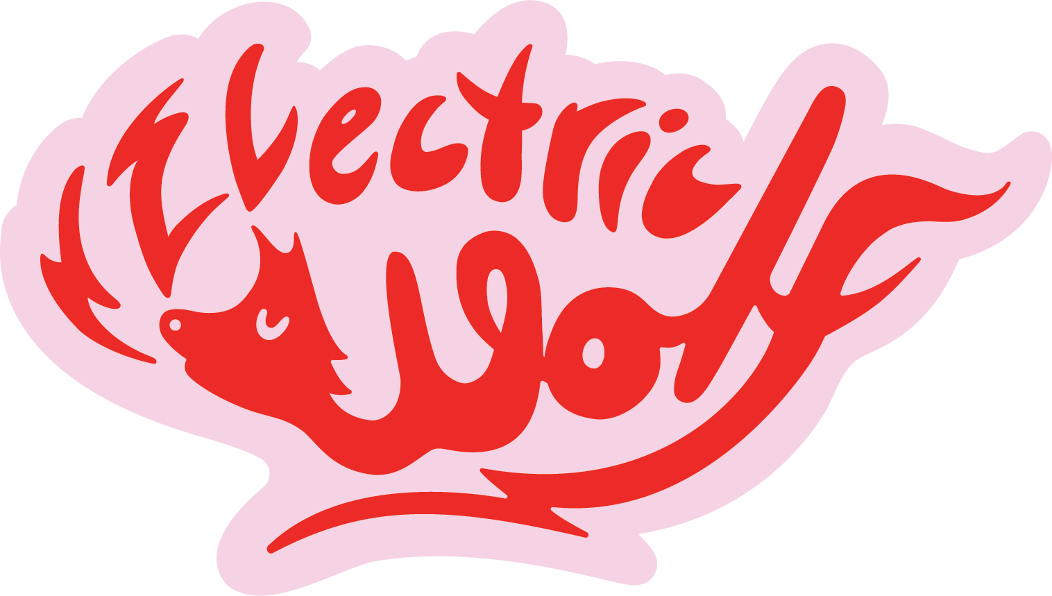
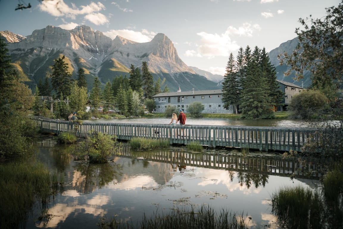
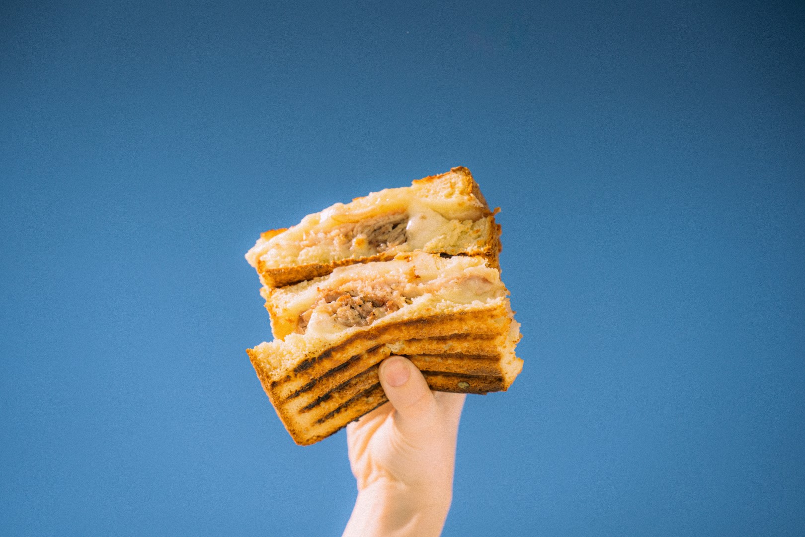
Electric Wolf Café is our all-day, neighborhood cafe in the heart of Downtown Canmore, AB, offering locally-sourced grab-and-go creations, prepared with love, by the team behind Rhythm & Howl. Our seasonal menu is crafted to satisfy the soul, whether you’re staying to soak in the mountain views or taking it on the go. Open seven days a week, we invite you to experience the vibrant, welcoming atmosphere and fresh flavors that make us a local favorite.
Tone of Voice
Playful & Quirky
Playful & Quirky
Use engaging and exciting tones of voice, It adds an element of fun and excitement to your communication, making your content shareable and memorable. This style is effective for building a personal connection with your audience. It’s like having a friendly chat with your followers, making them feel like part of an exclusive community.
Inspirational Reflective
Appeals to a sense of wanderlust and the desire for memorable experiences. Encourages followers to plan ahead for upcoming adventures
02.
Color
Each property type has it’s own dedicated (minimal) color palette.
The primary brand color for Electric Wolf are:
Red
RGB: R235 G47 B409
CMYK: C0% M80% Y83% K8%
HEX: #eb2f28
Pink
RGB: R243 G210 B228
CMYK: C0% M14% Y6% K5%
HEX: #f3d2e4
Sand
RGB: R228 G221 B211
CMYK: C0% M3% Y7% K11%
HEX: #e4ddd3
03.
Logos
& Typography
03.1
Logos
There are three versions of the logo for Basecamp Resorts, Canmore.
The three main logo types are:
The Primary Logo:
This logo can be used in situations where a centered layout is used.
There should always be ample space around the logo.
This version of the logo should be used as more of a reminder of our brand – where our logo or brand name has already been utilized or mentioned multiple times within the document.
There should always be ample space around the logo.


