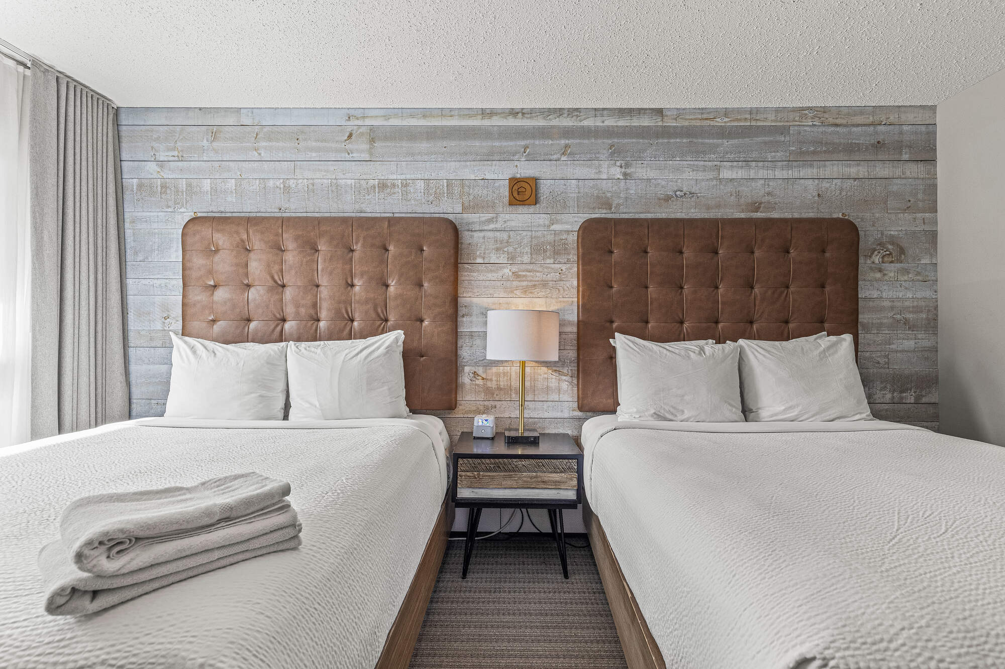
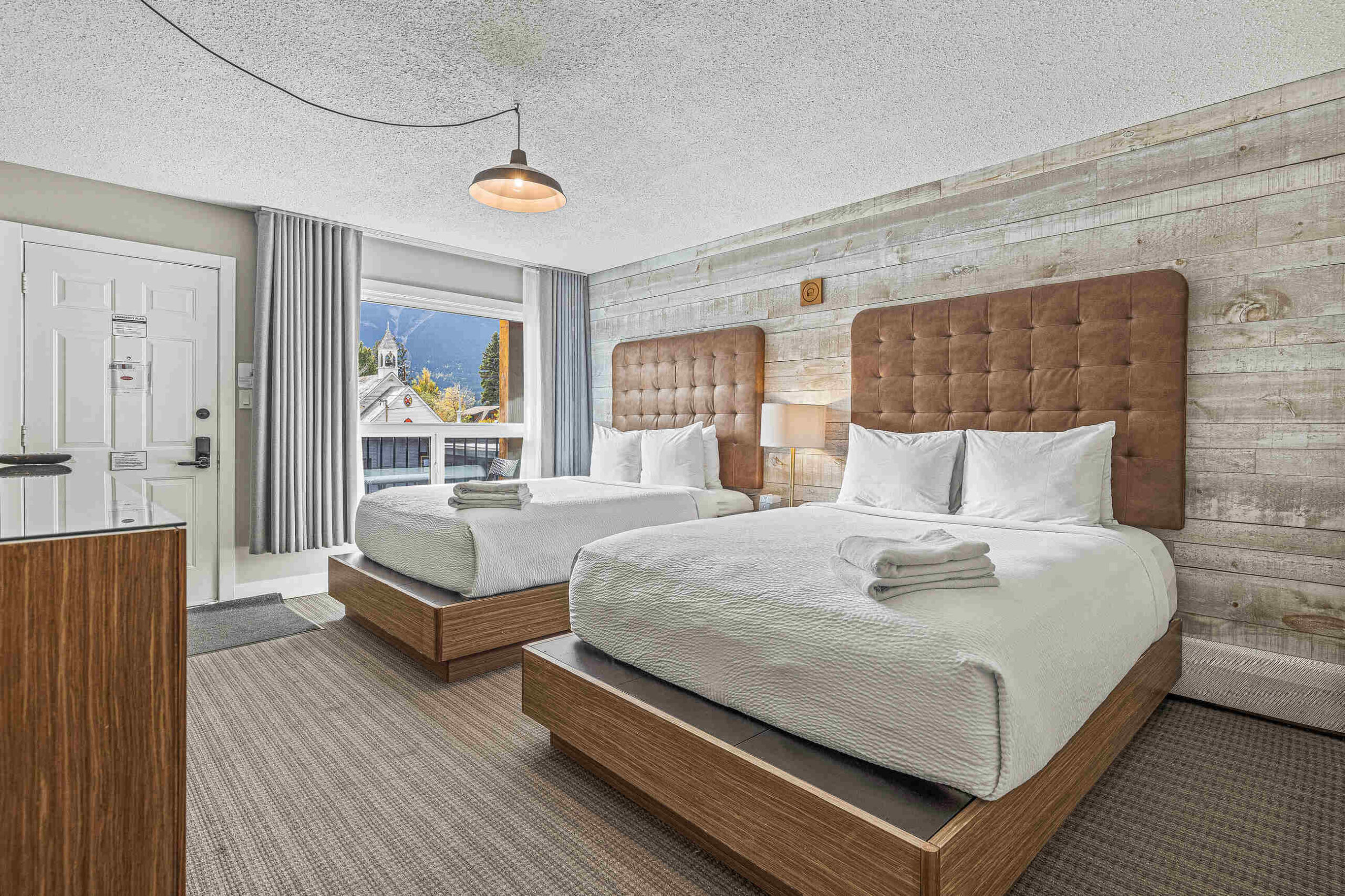
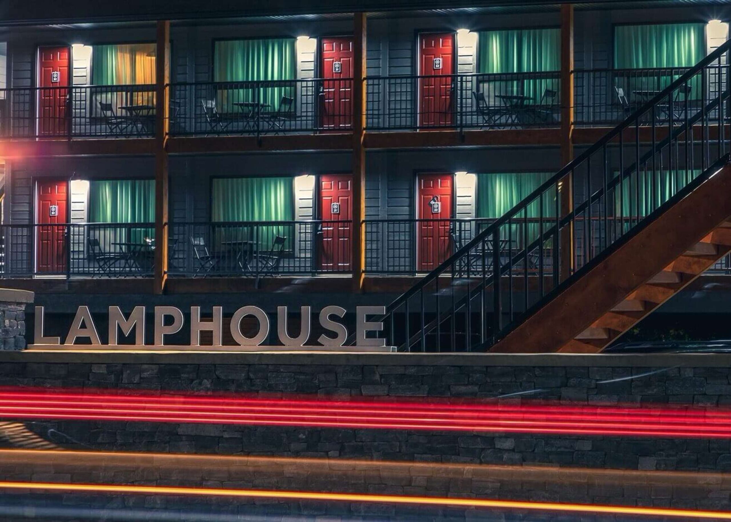
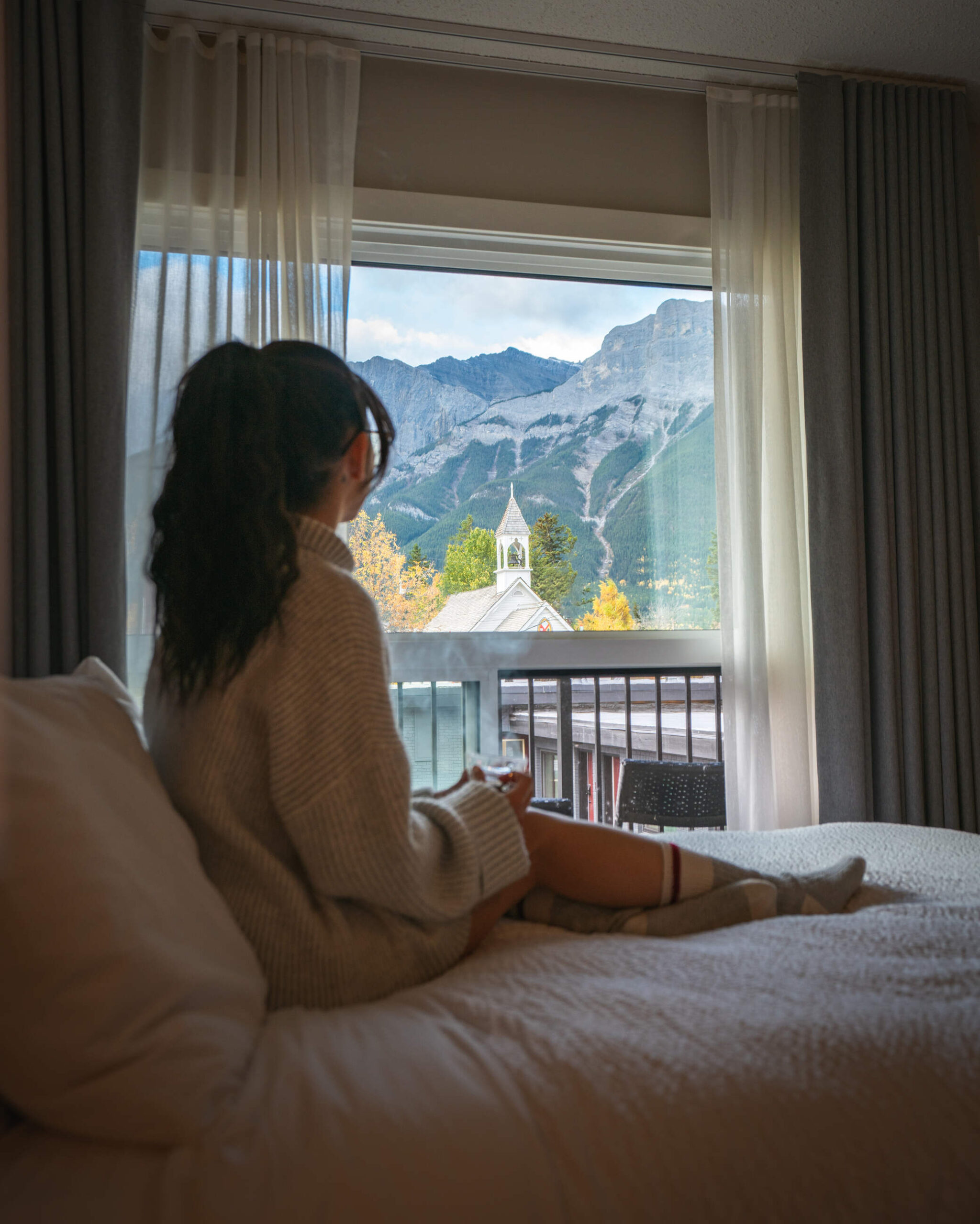
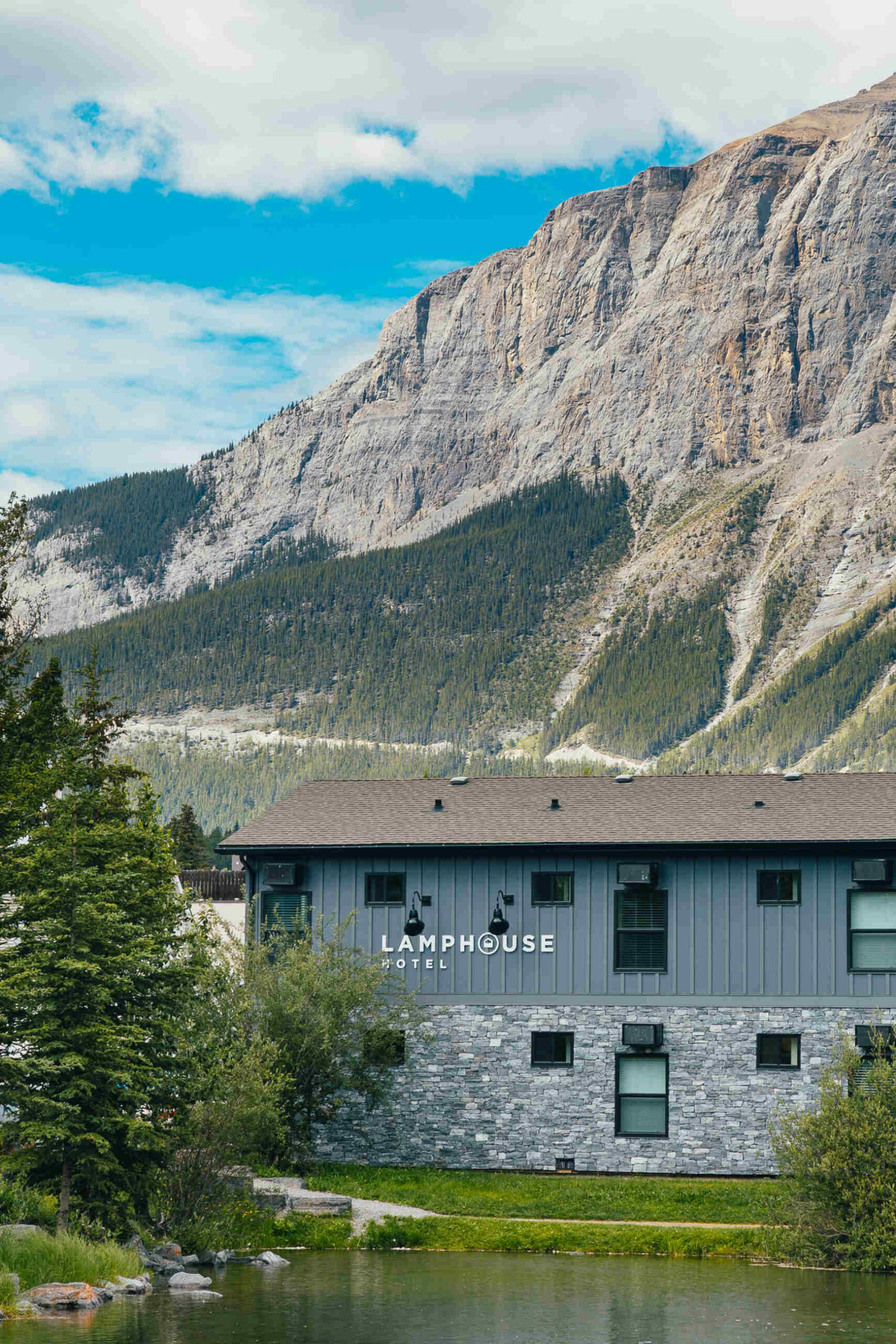
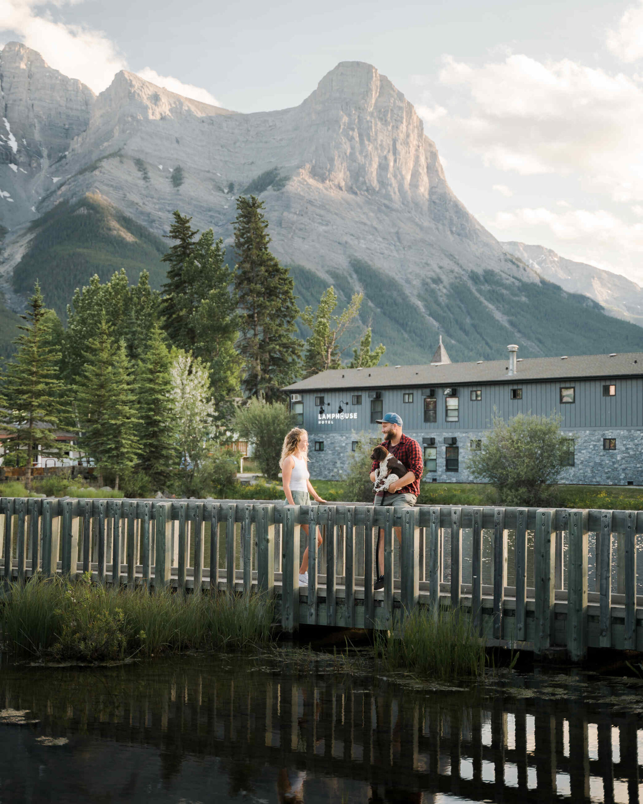
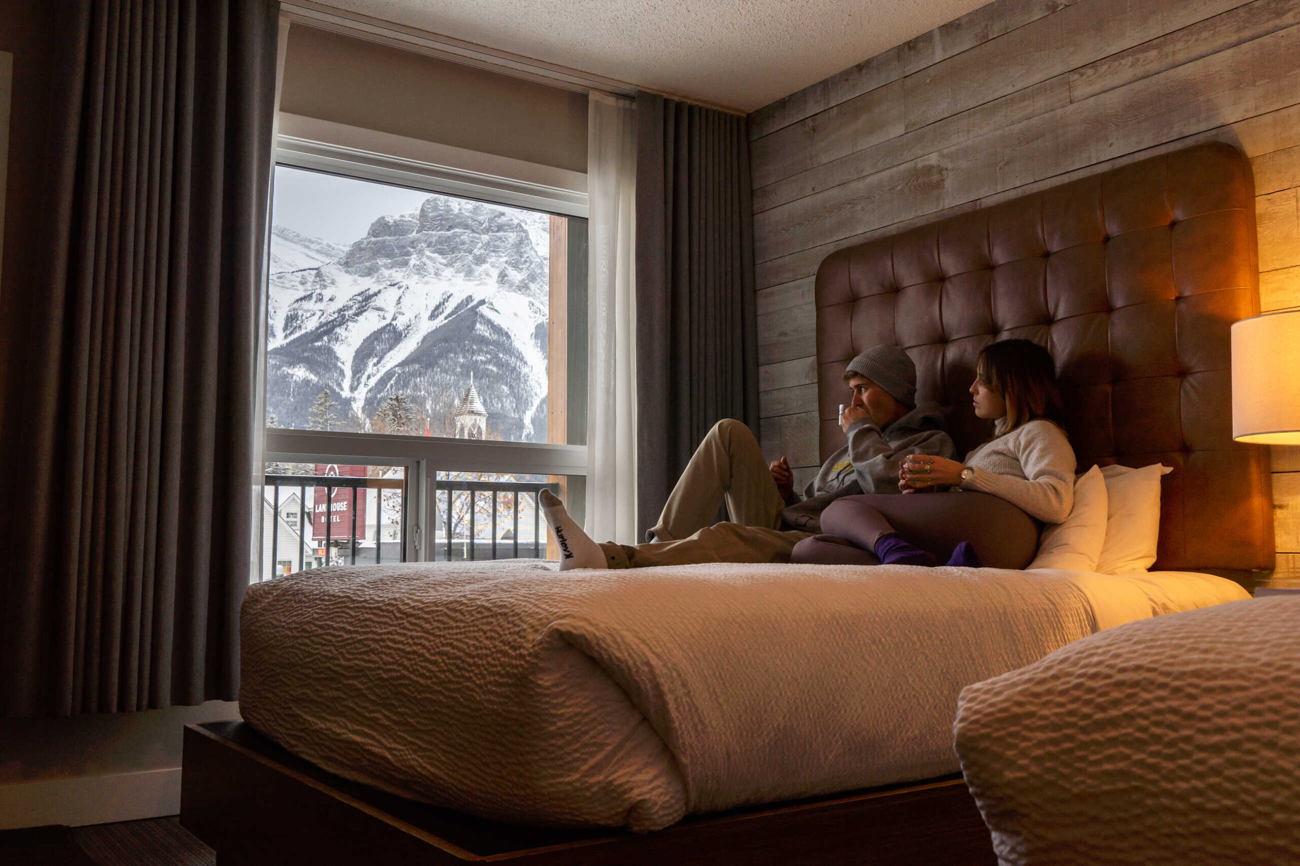
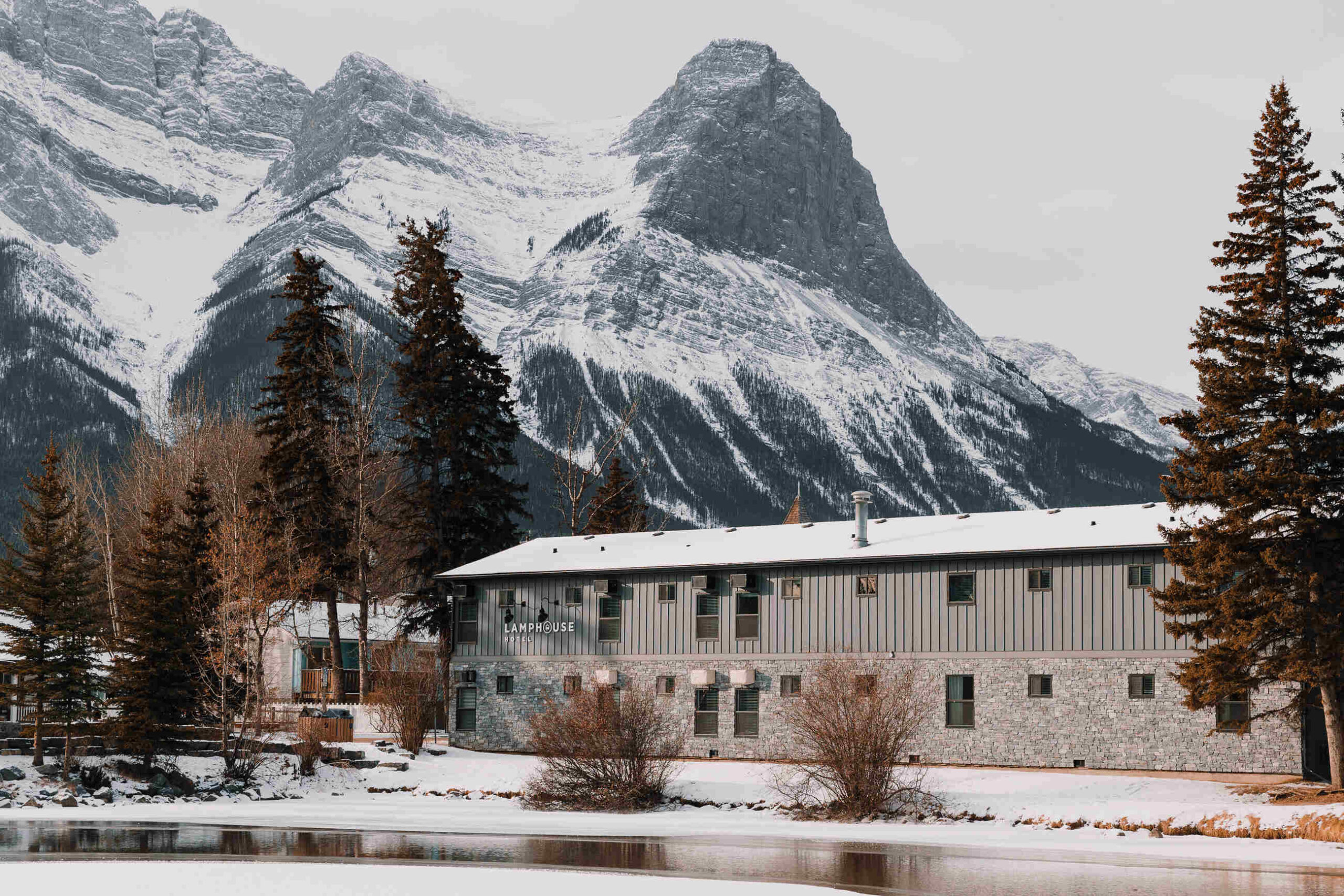
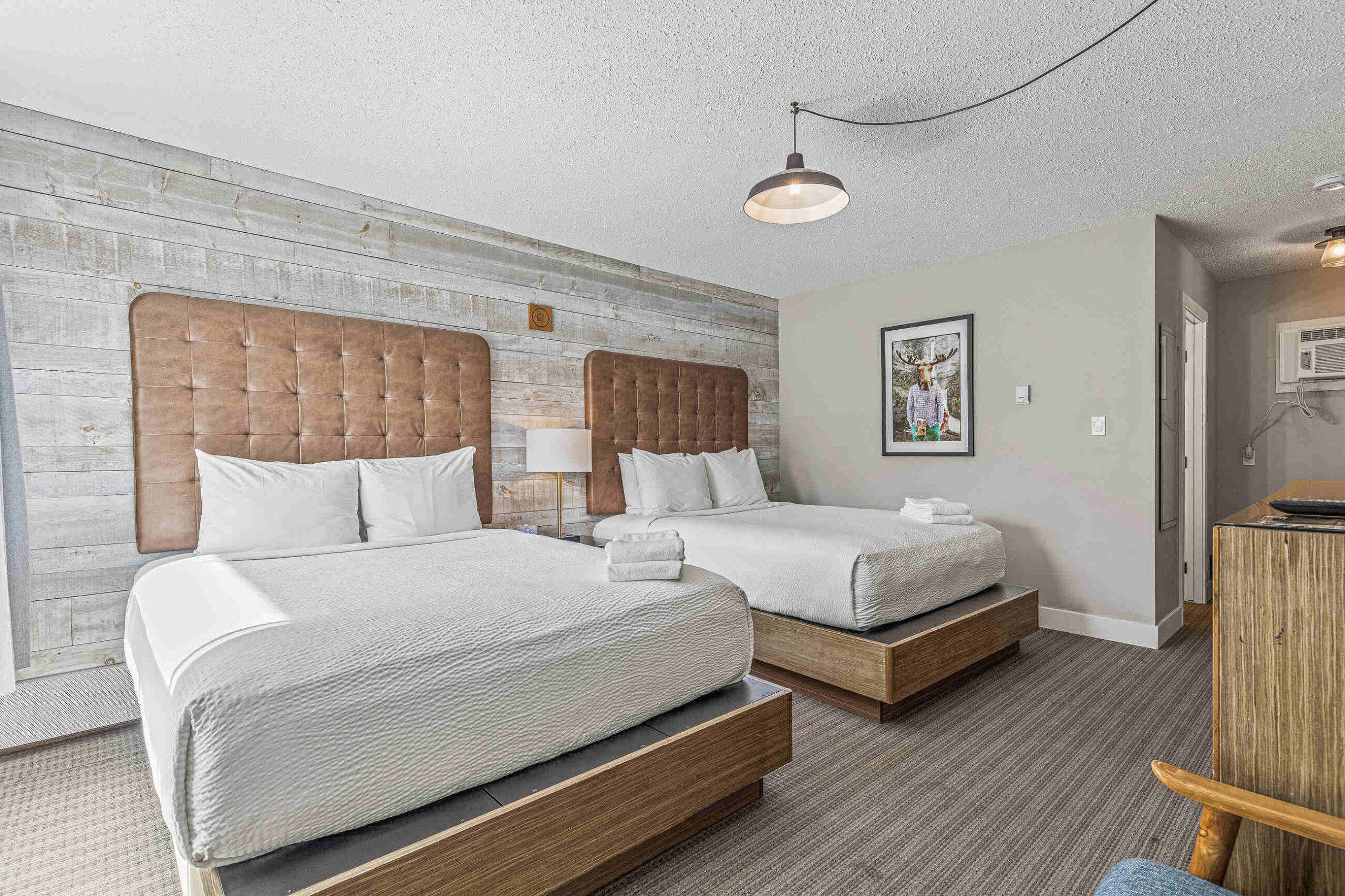
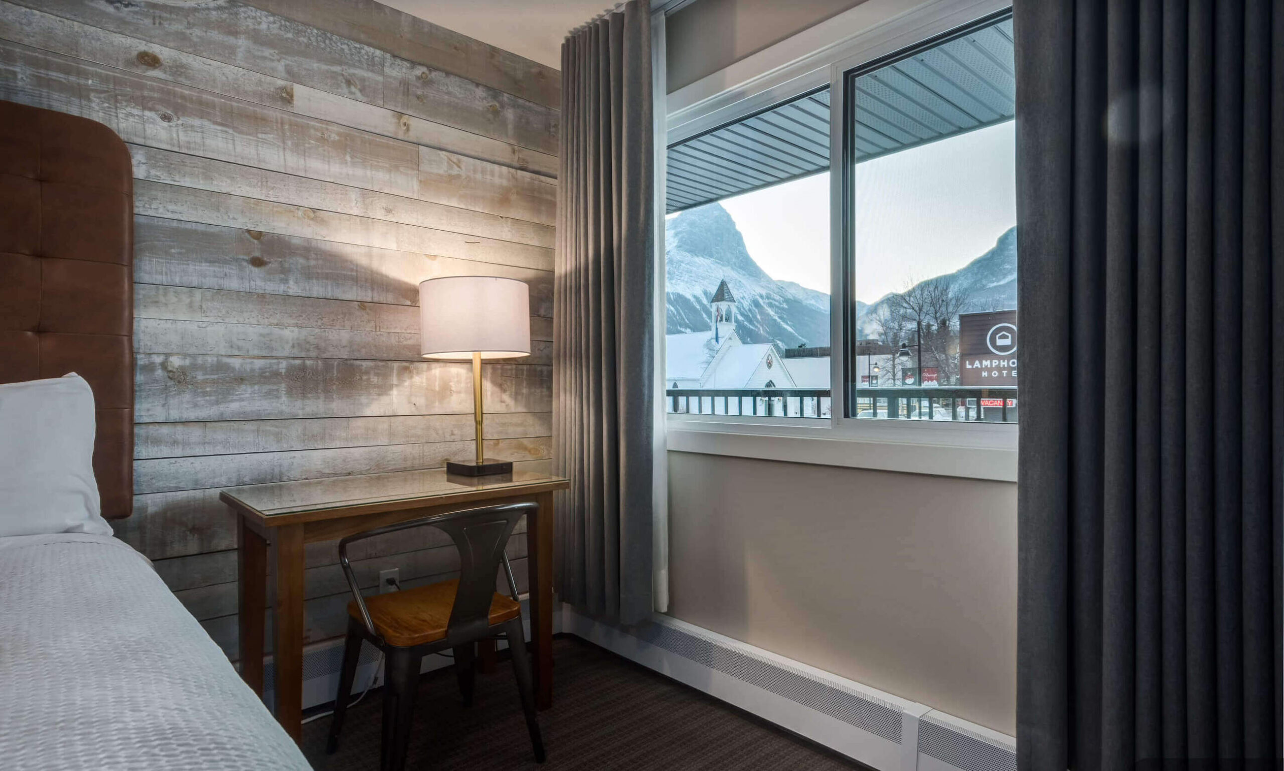
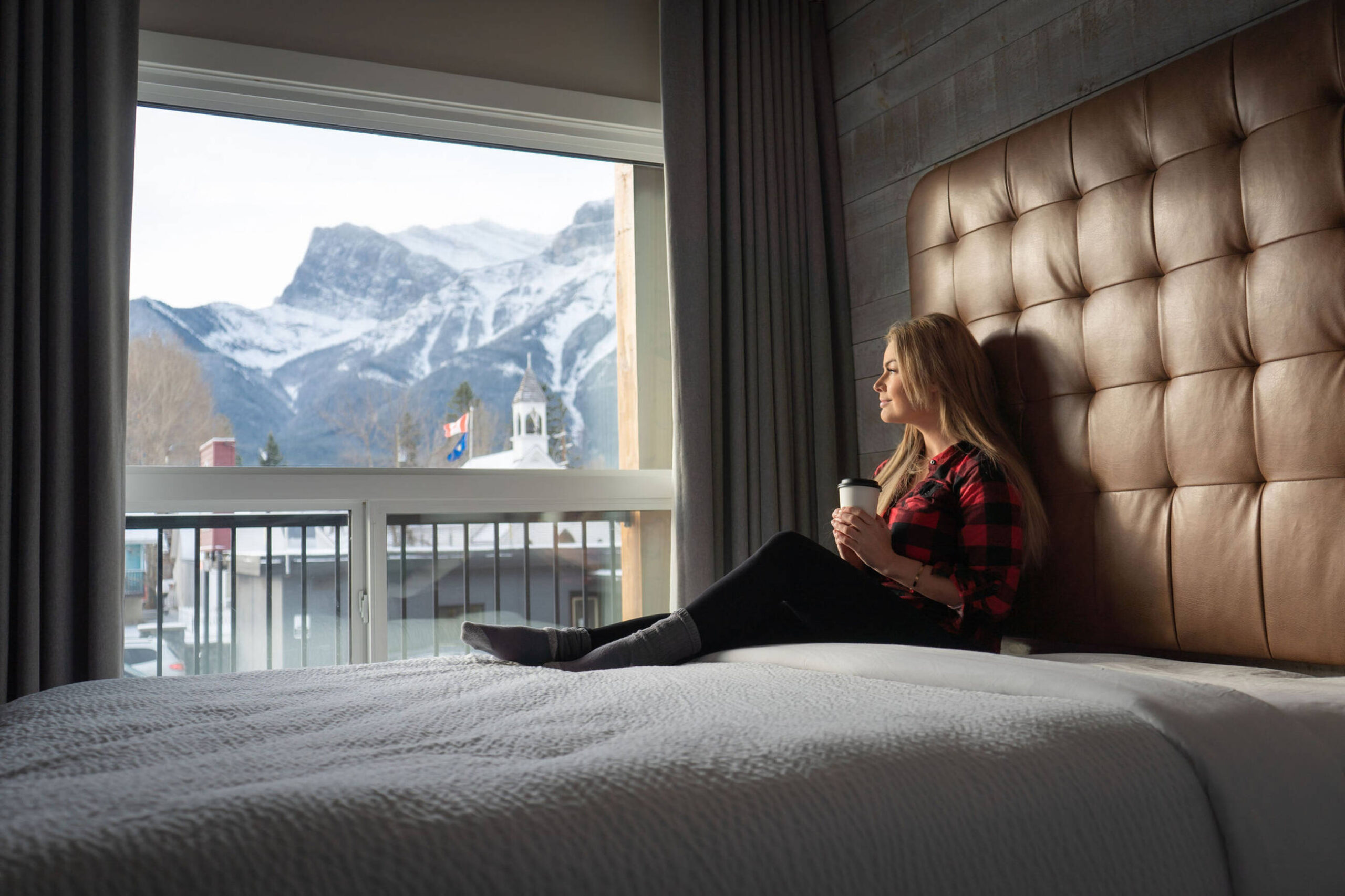
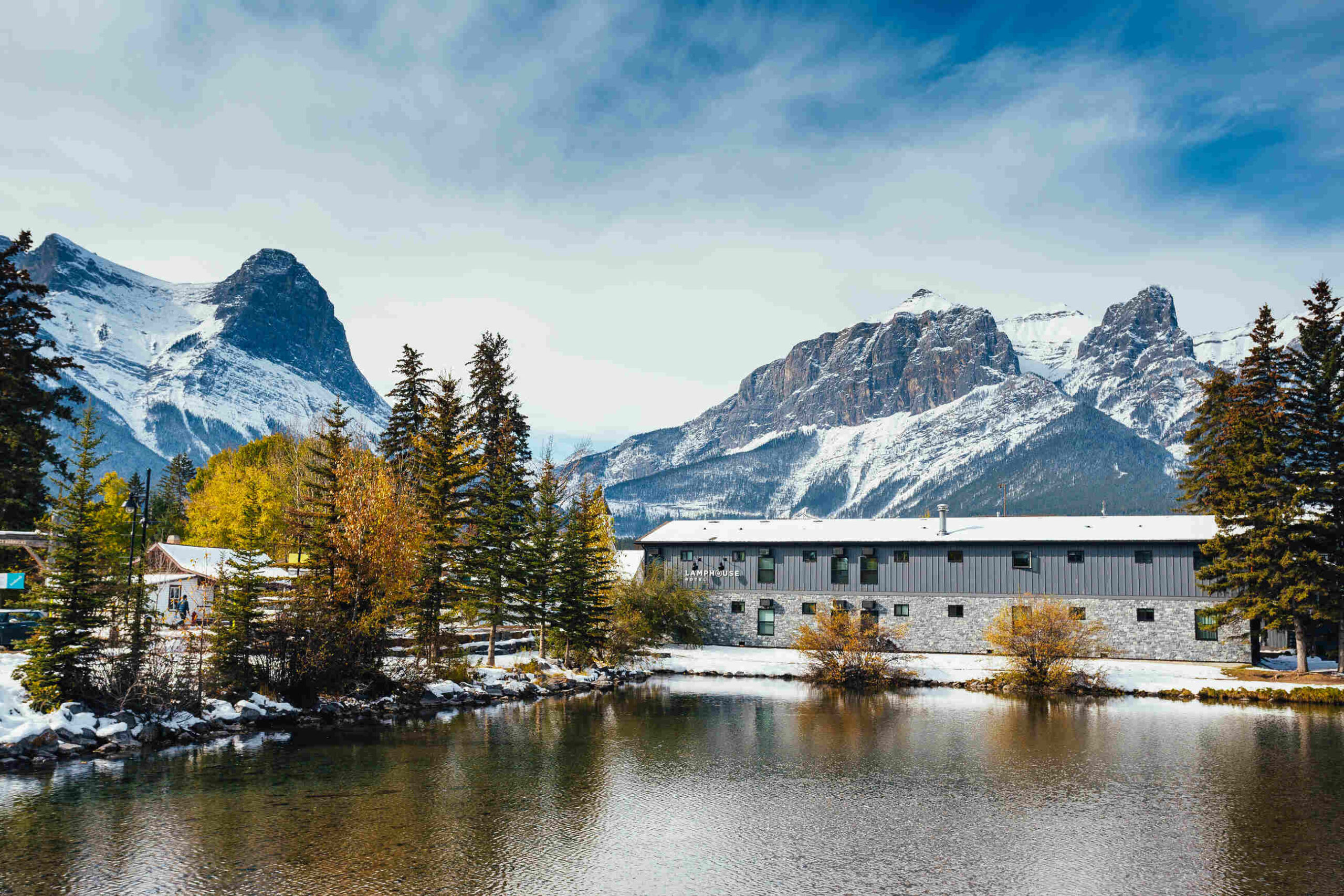
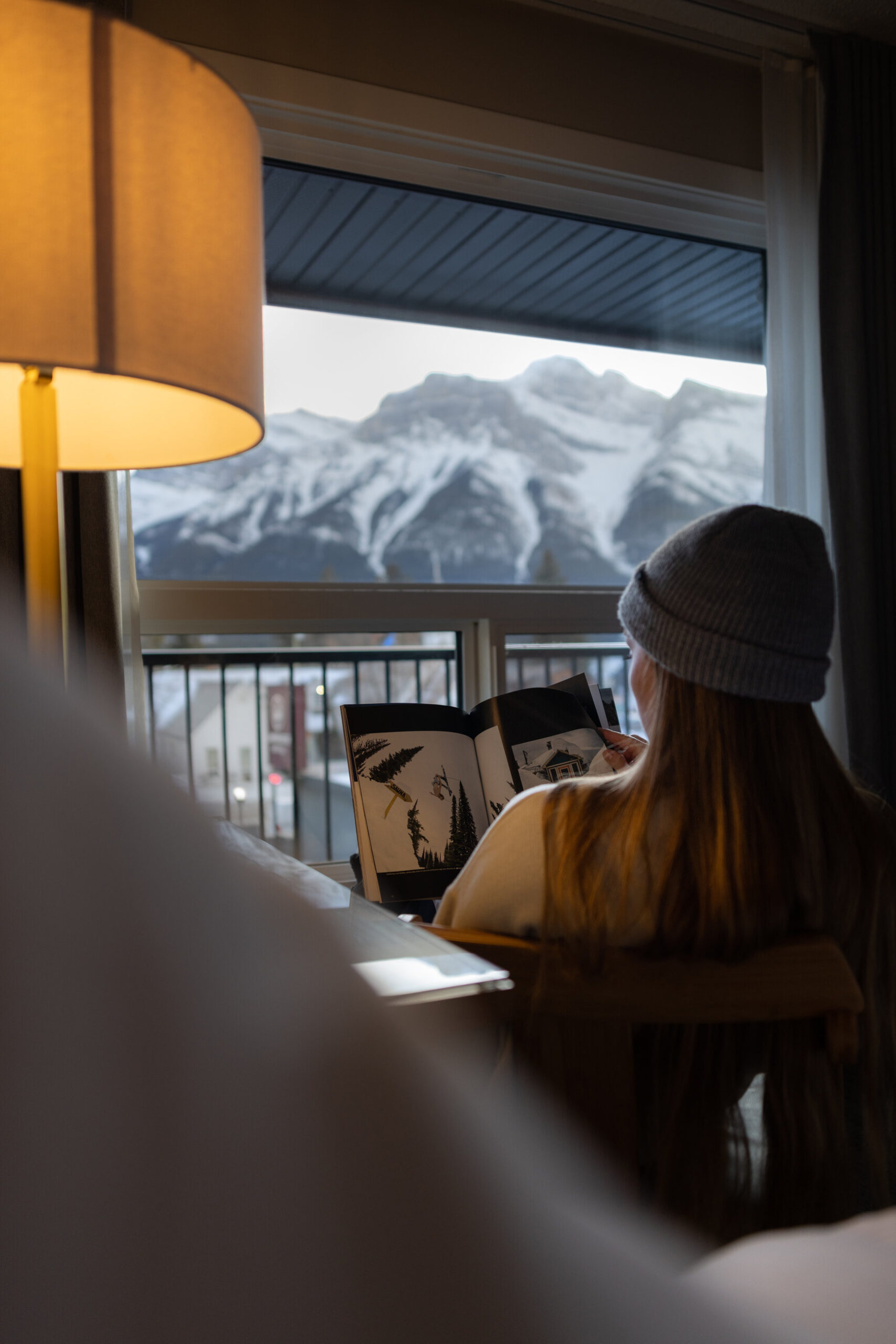
Lamphouse By Basecamp is a boutique motel nestled in the heart of downtown Canmore, Alberta, providing a modern twist on the classic motel experience. Offering a perfect blend of contemporary design and convenience, Lamphouse delivers everything guests need for a comfortable and stylish stay. With 26 rooms, this property is ideal for those who want to stay right in the center of the action while enjoying the natural beauty of the Rockies.
Amenities:
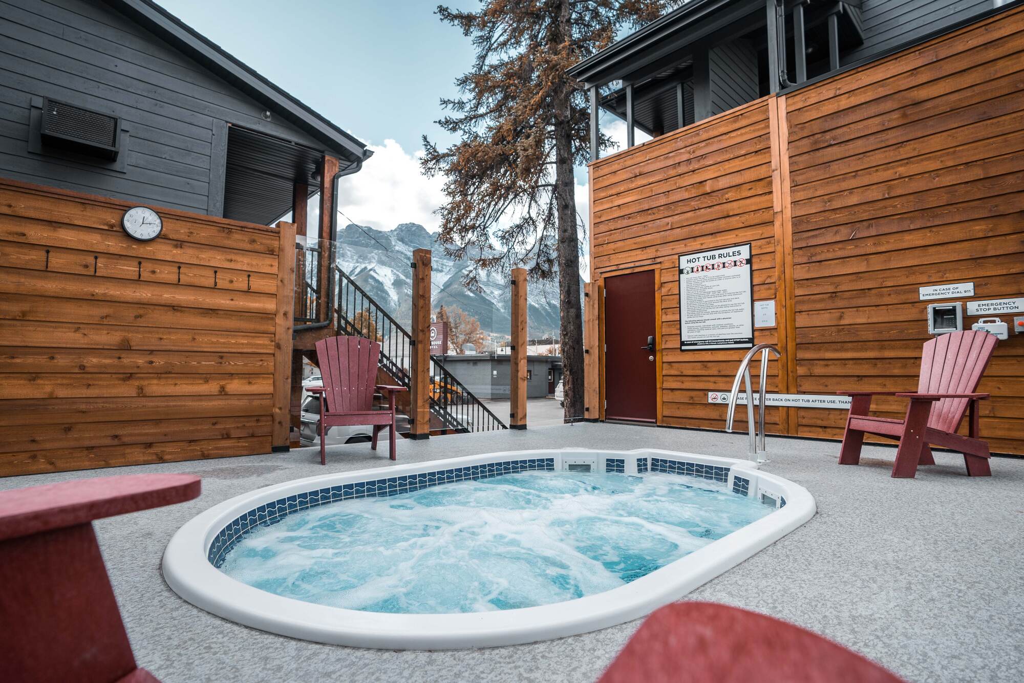
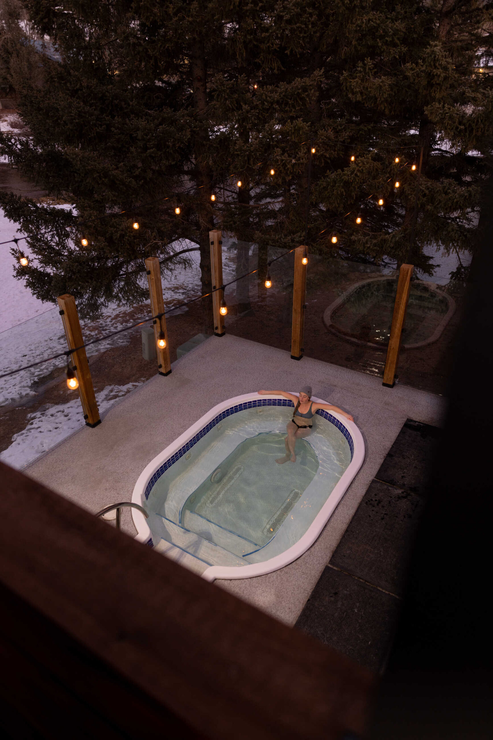
Riverside hot tub
Virtual check-in
Tone of Voice
Friendly & Conversational
Our tone should always feel like a conversation with a friend. Avoid overly formal or stiff language. Instead, focus on creating approachable, warm messaging that invites the reader into the experience.
Use casual language: “It’s time to escape to the mountains!” instead of “We recommend a mountain retreat.”
Personal touches: Speak directly to the reader by using “you” and “your.”
Exciting & Enthusiastic
Adventure is at the heart of what we do at Basecamp Resorts. The tone should inspire excitement, whether it’s about a new activity, a stunning view, or a comfortable stay at our properties.
Use energetic words: Words like “discover,” “explore,” “epic,” and “adventure” bring the content to life.
Avoid monotony: Keep the excitement fresh. “Ready for the adventure of a lifetime?” is much more engaging than a standard “Plan your trip.”
Inviting & Relaxing
We provide more than just a place to stay—our resorts are a home away from home. It’s important to balance the excitement of adventure with a sense of calm, comfort and convenience.
Highlight cozy, comforting aspects: Use phrases like “cozy nights by the fire” or “peaceful mornings with a view.”
Blend comfort with excitement: “Unwind after a day of mountain exploring.”
Include messaging about the easy access to endless Adventures?
Playful & Engaging
Don’t be afraid to have a little fun. A light-hearted, playful tone shows that we are a modern and dynamic brand.
Incorporate humor: A playful touch can go a long way. Phrases like “Canmore weekend vibes, anyone?” add personality.
Ask questions: Engage your audience with prompts and questions to create interaction.
Preferred Words & Phrases
These are core words and phrases that reflect the brand and should be used consistently across platforms:
Do: Use verbs like “explore,” “discover,” “escape,” “dive into,” and “unwind.”
Don’t: Avoid passive language like “We have accommodations available.” Instead, try “Book your mountain retreat today.”
This version of the logo should be used as more of a reminder of our brand – where our logo or brand name has already been utilized or mentioned multiple times within the document.
There should always be ample space around the logo.
The Primary Basecamp brand font is Gotham.
Variations on this font (eg. Gotham Light, Italics, etc) may be used, if used appropriately and within the below hierarchy.
Header Font (Gotham Pro)
Body Copy font (Gotham Book) Posuere aliquam. Integer vestibulum mi leo, ac accumsan metus bibendum vitae. Proin quis neque volutpat, ultricies augue et, fringilla lectus. Nulla facilisi


