Rhythm & Howl is ….. (This is all just filler atm)
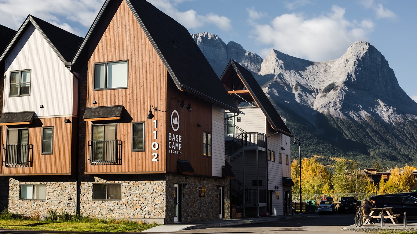
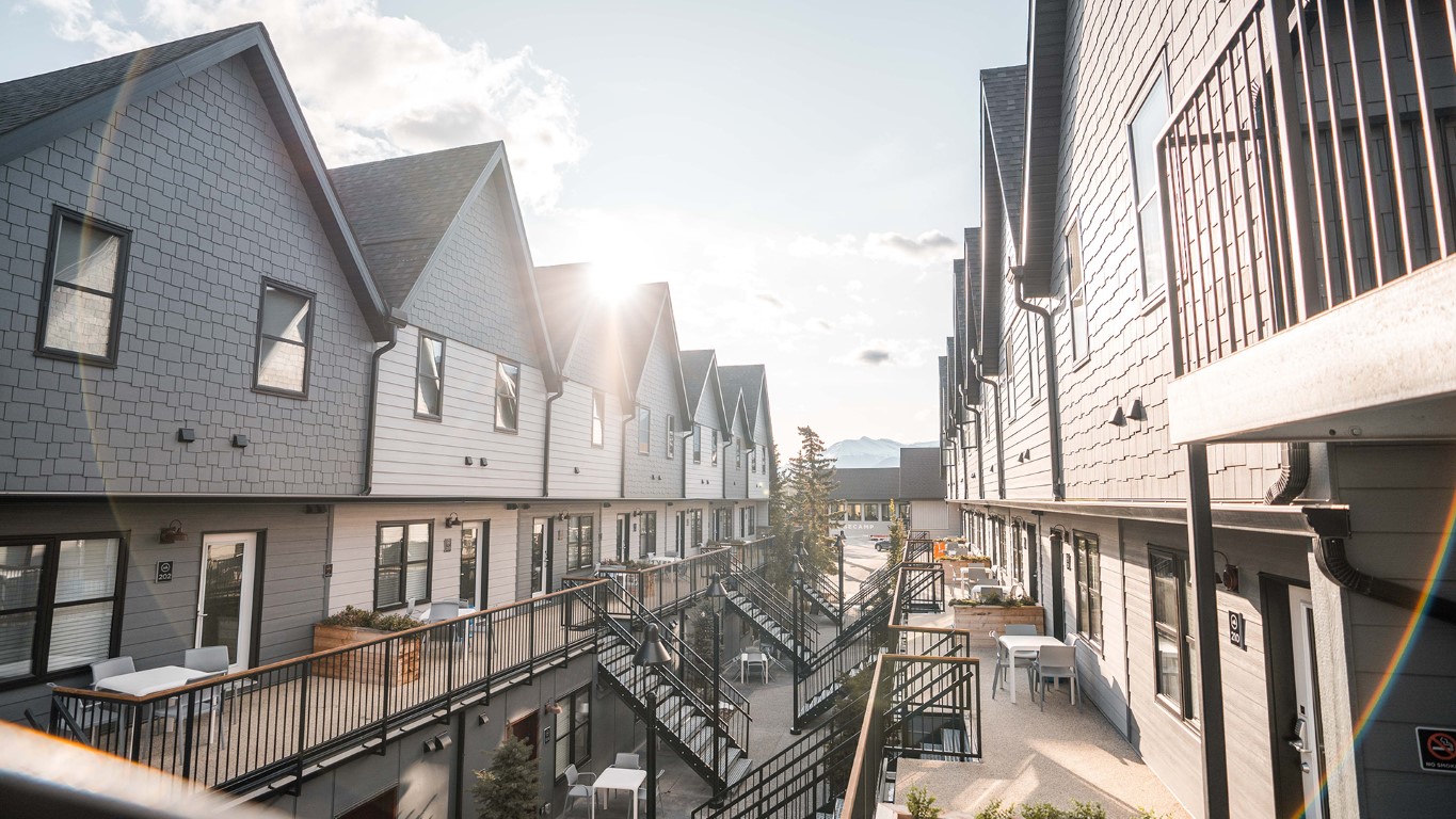
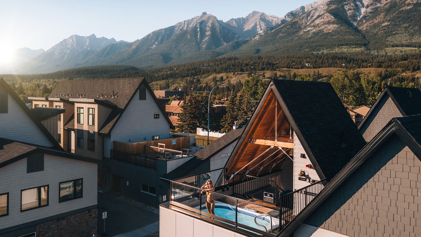
Basecamp Resorts Canmore, Basecamp’s first property opened its doors in September 2017. With its multi-bedroom units and extensive living space, the original Basecamp Resorts is designed to appeal to extended families or large groups of friends who want to explore Canmore and feel at home during their outdoor escape.
Property Features:
32 apartment style units, each fitted with kitchens, washers, and dryers.
Units are located on the ground level and second floor.
Two buildings (Building 1 located on the Bow Valley Trail side & Building 2 located on the CPR track side).
Outdoor hot tub.
Tone of Voice
Playful & Quirky
Use engaging and exciting tones of voice, It adds an element of fun and excitement to your communication, making your content shareable and memorable. This style is effective for building a personal connection with your audience. It’s like having a friendly chat with your followers, making them feel like part of an exclusive community.
Inspirational Reflective
Appeals to a sense of wanderlust and the desire for memorable experiences.Encourages followers to plan ahead for upcoming adventures
02.
Color
Each property type has it’s own dedicated (minimal) color palette.
The primary brand color for Rhythm & Howl is:
Coral
RGB: R224 G101 B89
CMYK: C0% M55% Y60% K12%
HEX: #e06559
Sand
RGB: R228 G221 B211
CMYK: C0% M3% Y7% K11%
HEX: #e4ddd3
Stone
RGB: R59 G56 B51
CMYK: C0% M5% Y14% K77%
HEX: #3b3833
Pine
RGB: R042 G045 B001
CMYK: C7% M0% Y98% K82%
HEX: #2a2d01
03.
Logos
& Typography
03.1
Logos
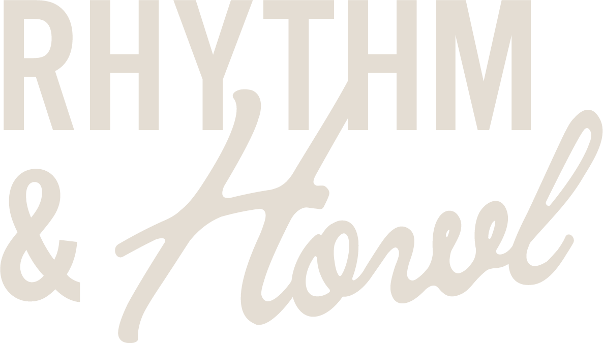
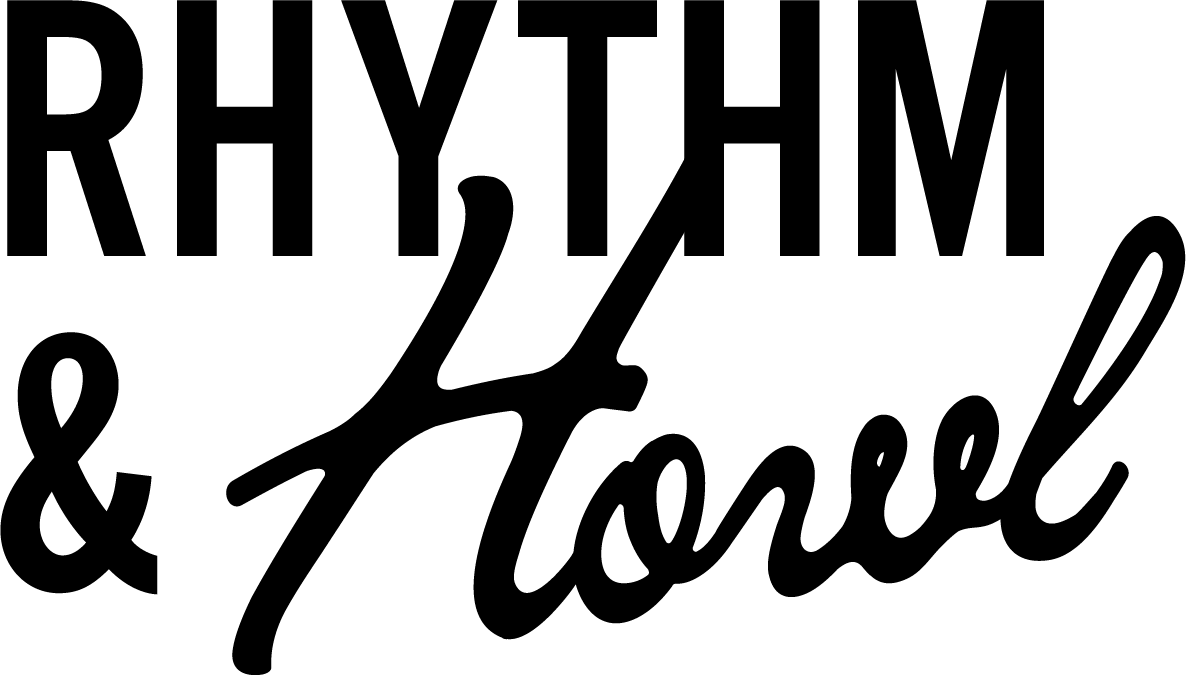
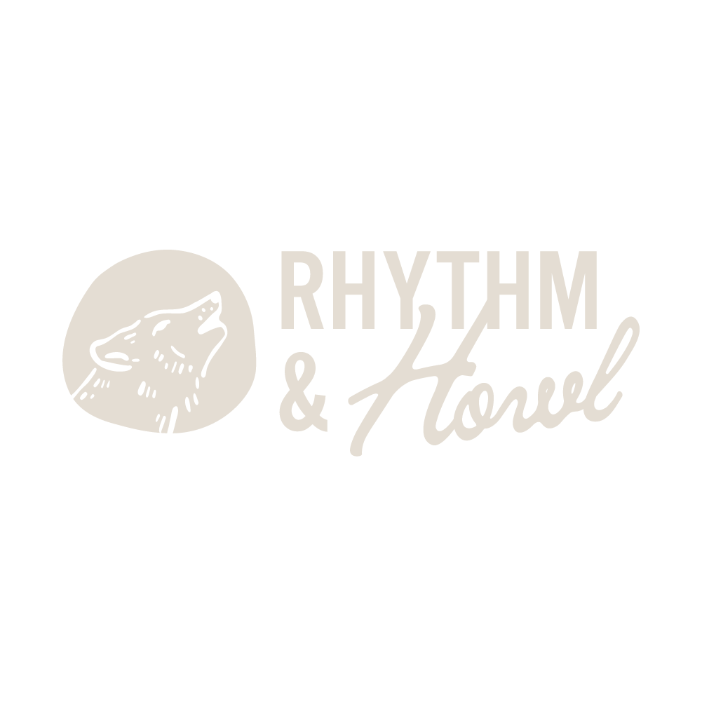
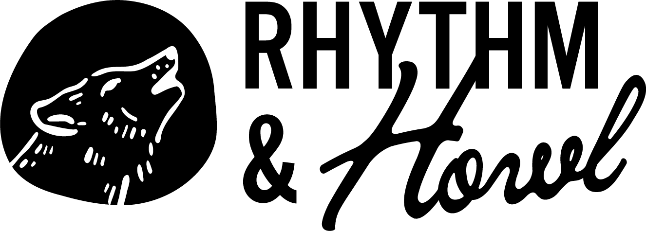
There are multiple versions of the Rhythm & Howl logo, available in all of our brand colors.
The three main logo types are :
The Wordmark:
This logo can be used in situations where a centered layout is used.
There should always be ample space around the logo.
This version of the logo should be used as more of a reminder of our brand – where our logo or brand name has already been utilized or mentioned multiple times within the document.
There should always be ample space around the logo.
This fount should be used sparingly, when more decorative text may be required.
Lumiraire Script
This font should be used sparingly, when more decorative text may be required.
Alternative Gothic No3 D
This font may be used as a header font.
Mr Eaves Mod OT
This font may be used as a body copy font.
Where these fonts are not suitable, please utilize the Gotham family, as per the general Basecamp brand guidelines.
04.
Collateral
04.1
Restaurant Collateral
The following items of printed collateral are standard within the restaurant:
Menus (brunch, dinner, happy hour, drinks). If more menus are required, these must be ordered (printed externally, locally) by the restaurant manager.
Printed signage (hours, host stand sign, additional promotional materials etc)should be designed by the marketing team. To request any additional design work, please fill out the form below.
Bill postcards (restaurant manager to order from Vista Print)
Gift cards (restaurant manager to order from Vista Print)
Local’s discount cards (restaurant manager to order from Vista Print)
All postcard collateral must be neatly presented and within the wooden card stand.
04.2
External Promotional Collateral
External promotional collateral refers to any printed material distributed outside the restaurant. This includes:
R&H Basecamp discount postcards & business cards
05.
Press Images
A gallery of our favourite Rhythm & Howl Images. Do not stretch, distort or alter these images in any way
